Thursday 26 December 2013

Have you lost a spoon at work?

Doing my annual Christmas clean of my kitchen, I found 7 forks, 4 spoons and 1 knife that I never bought. Where on Earth did these spoons come from? Is my kitchenware breeding and evolving? On the other hand, my cutlery always goes missing from work, so much so that I have stopped keeping it in communal areas.

A 2005 paper, The case of the disappearing teaspoons: longitudinal cohort study of the displacement of teaspoons in an Australian research institute, casts a light on my problem. It set out to determine the overall rate of loss of teaspoons in a research institute of 140 people and whether how quickly they disappear depends on the value of the teaspoons or type of tearoom. They conducted a longitudinal cohort study by placing 70 discreetly numbered teaspoons in tearooms around the institute and observed the results over five months.

They found that 56 of the 70 teaspoons disappeared during the five month study. The half life of the teaspoons was 81 days, with the half life of teaspoons in large communal tearooms (42 days) significantly shorter. At this rate, an estimated 250 teaspoons would need to be purchased annually to maintain an institute-wide population of 70 teaspoons.

So it looks like I may have contributed to this problem at my workplace. On the other hand, a percentage of my own cutlery must now be in the kitchens of my workmates.

References:

Megan S C Lim (2005). The case of the disappearing teaspoons: longitudinal cohort study of the displacement of teaspoons in an Australian research institute BMJ DOI: 10.1136/bmj.331.7531.1498

Determining the best cricket team of all time using the Google PageRank algorithm


My plan for each summer holiday is pretty simple. It involves BBQs, the ocean, and watching the cricket. This summer we are being treated to an Ashes series, that at the time of writing, Australia has already won convincingly. England were regarded as favourites for this series and Australia has performed well above expectations. But how good are these teams compared with teams of the past?

Satyam Mukherjee at Northwestern University has come up with a novel approach to ranking cricket teams. In his paper, Identifying the greatest team and captain—A complex network approach to cricket matches, Mukherjee uses the Google PageRank algorithm to rank the various Test (and One Day International) playing countries, and also the team captains. PageRank works by counting the number and quality of links to a page to determine how important the website is. The underlying assumption is that more important websites receive more links from other websites. What Mukherjee has essentially done is instead of tracking links, he has tracked team wins, so that an estimate of a team's quality is made by looking at the quality of teams it has defeated. 

After considering all Test matches played since 1877, and all One Day International matches since 1971, Mukherjee identified Australia as the best team historically in both forms of cricket, Steve Waugh as the best captain in Tests, and Ricky Ponting in ODIs. With regards to captains, it is hard to conclusively prove that it was the captain's influence that made them good teams - Australia under Waugh and Ponting were formidable and pretty much anyone could have captained them. This ranking method also only compares teams against their contemporaries. That is, it is not saying that Waugh's team was better than, say, Bradman's 1948 team. It is saying that Waugh's team was further ahead of the rest of the world than Bradman's was in 1948. Unless you have a time machine, it is very difficult to compare across era.

You can read more about how the Google PageRank algorithm works in The amazing librarian, and check out our previous article on sporting ranking systems for chess and sumo wrestling.

This is of course not the first study to apply objective science to a subjective topic within cricket. In the paper The effect of atmospheric conditions on the swing of a cricket ball, researchers from Sheffield Hallam University and the University of Auckland debunk the commonly held belief that humid conditions help swing bowling. But they don't discount the theory that cloud cover helps.

They used 3D laser scanners in an atmospheric chamber to measure the effect of humidity on the swing of a ball, and found that there was no link between humidity and swing. They postulate at the end of the paper that cloud cover may have an influence on swing. Cloud cover reduces turbulence in the air caused by heating from the Sun and they theorise that still conditions are the perfect environment for swing. When a ball moves through the air, it produces small regions of slightly higher and lower pressure at various points around it. This causes the ball to swing. If the air is already turbulent, it is more difficult to sustain these regions and so therefore there is less swing. Imagine throwing a stone into a still lake - the ripples around where the stone lands are easy to spot and move for some distance. Compare this to throwing a stone into an already turbulent ocean - you can barely spot the ripples as the turbulence in the water is much greater than any effects from throwing the stone.

If you think about the places where swing bowling has been most effective - England, New Zealand, Hobart - this theory appears sound, however more study is needed to prove it. So I'll endeavour to watch as much cricket as I can this summer, in the name of science.

References:
Satyam Mukherjee (2012). Identifying the greatest team and captain—A complex network approach to cricket matches Physica A: Statistical Mechanics and its Applications DOI: 10.1016/j.physa.2012.06.052  

David James (2012). The effect of atmospheric conditions on the swing of a cricket ball Procedia Engineering DOI: 10.1016/j.proeng.2012.04.033

Saturday 28 September 2013

Ep 152: Spiderman Part 2


In part 2 of the Spiderman series, Dr Boob looks at the amazing properties of spider silk and how Peter Parker might harness various technologies to appropriately use it.

It's the final show from Dr Boob for a while and we will miss him greatly! But he's not disappearing completely - show him you care over on twitter - @doctor_boob

Tune in to this episode here.


Cover by Nippoten
Songs in this episode:

Sunday 15 September 2013

Ep 151: Spiderman Part 1


This is our last Science of superheroes for a while so we thought we'd look at one of the big guys. Over two episodes, Dr Boob examines Spiderman and in episode one, he specifically looks at how to manipulate Peter Parker's DNA using a virus to transport engineered DNA into his cells. It is by changing his genetic structure that we can allow him to have his superhero abilities, which for Spiderman are largely exaggerated spider traits as well as something called a "Spidey sense".

Tune in to this episode here.


Cover image from NanAmy-BoT
Songs in the podcast by:

Modelling an all-time greatest musical playlist


The popularity of Triple J's annual Hottest 100 has made my wonder what my favourite songs of all time are and whether I could come up with a list based on some actual data. The information I have to use is my iTunes data since 2005. Being only 8 years of my life, this data set is limited. But with any luck (that is, if the assumptions hold true) the following algorithms will stay appropriate into the future and require only minor tweaking. What we're trying to do is come up with a method that will tell me, from my listening habits in iTunes, what my favourite songs are. Whether you actually listen to your favourite songs more than others is a debate for another time.

iTunes doesn't tell you when songs were played, just how many times, so the useful parameters we can export for each song are "Play Count" (p) and "Date Added". If we add up all the individual play counts, we get the "Total Play Count" for the entire collection (P). Date Added can be turned into the number of days the song has been in the collection - time (t). We also know the number of songs in the collection now (N) and at various times in the past when I've exported the data.

First cut:
An easy first-cut model is to simply divide each song's play count by its time in the collection and order the songs by this rate of play. As a first attempt this may seem logical, however the problem is that it is heavily biased towards newer songs. You're likely to listen to a song a few times after you add it before it slips back into your various playlists. It also doesn't take into account that there are more songs in the collection now than at the start.

What we need to do is come up with an equation that tells us how many times a song is expected to have been played depending on when it was added. We can then compare this number to how many times it was actually played and order the songs by this ratio.
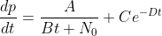
Second cut:


This second version suffers from the same biasing problem as the first, but does take into account that the number of songs in the collection is changing over time. This is important as if you assume that you listen to music for about the same amount of time each day, then the more songs you have in your collection, the less likely you are to randomly hear the same song twice. Hence, songs that are played regularly when the collection is small should not be treated in the same way as songs played with the same frequency when the collection is large. N0 is the number of songs in the collection at t0. This model assumes that the number of songs in the collection grows linearly over time (A and B are constants) - that is, the same number of songs are added each month. This is about right for my collection. The integration is left as an exercise for the reader (hint, you get a log function).

Third cut:


This final version takes into account that when you add new songs to your collection that you like, you are likely to listen to them quite a lot, independently of the number of songs that are already there - that is, they get added to a "new songs" playlist. The novelty of a new song eventually wears off, so the way we've modelled this is to use an exponential factor. You can tweek the coefficients (C and D) by thinking about the "half life" of a new song. The integration is left as an exercise for the reader (hint, you get a log function and an exponential).

The equation now contains two components - the first modelling the number of plays expected through random play and the second the impact of adding new songs to the collection. The model suggests that I play the same number of songs each year (apart from a barely perceptible increase due to the exponential factor) and it seems to work pretty well. This model won't work if and when I swap over to streaming music, as opposed to owning it, as my major form of music consumption, but for now it's holding up. Having played around with the coefficients, the list as it stands is below. It pretty much represents upbeat songs I go running with and songs my 2-year old likes - for whatever reason, he likes Korean pop music! I have to think that the novelty of Psy will wear off over time, but Hall and Oates, they'll never die.

Gangnam Style PSY
I Remember Deadmau5 and Kaskade
ABC News Theme Remix Pendulum
You Make My Dreams Hall & Oates
Shooting Stars Bag Raiders
This Boy's In Love The Presets
Get Shaky Ian Carey Project
Monster BIGBANG
From Above Ben Folds
Banquet Bloc Party


Monday 15 July 2013

And introducing...


And introducing to the world, Hazel Clara West. We're all very happy! She's the baby by the way if there was any doubt... She has a proud big brother.

Sunday 14 July 2013

Ep 150: Bryan Gaensler at 20 years of the Sydney University Science Talented Student Program

I recently attended the 20 year anniversary of the Sydney University Faculty of Science Talented Student Program. That was an intimidating event! The evening was hosted by Adam Spencer and featured an in-conversation with Professor Bryan Gaensler, Dave Sadler (Bryan's former mathematics high school teacher) and Alison Hammond, a current TSP student. The kind people at the Sydney Uni Faculty of Science have allowed me put the audio up here, so a big thanks to them - all attribution, love and praise should be sent their way. It was a very interesting evening to hear what encouraged one of Australia's most well-known scientists into astrophysics, along with the always witty Adam Spencer. Tune in to this episode here.


The two songs used in this episode are by Keytronic / CC BY-NC 3.0 and Jeris / CC BY-NC 3.0

Saturday 4 May 2013

Ep 149: Zombies Part 2

In the second of a two part series on zombies, this week we go deeper in the dark world of the undead. In part one we managed, through a combination of drugs, to create zombie-like creatures who were sluggish and largely brain-dead. This week we have a shot at recreating the zombies of films such as I am Legend - creatures created through the transmission of a virus, who are filled with rage and enjoy the taste of brains. Topics covered include:
  1. Mad cow disease and the use of prions to transmit disease,
  2. Chimpanzees who eat brains,
  3. Methamphetamines for the creation of rage,
  4. Mathematical modelling a zombie pandemic and how the zombies could do this sustainably.
Somehow we ended up proposing a "Planet of the zombie apes" movie idea, and a methamphetamine-infused biodome. It might not pass an ethics committee. Tune in to this episode here.


In the podcast we use a few songs, all licensed under a Attribution Noncommercial (3.0)
I As We by Speck
Big John by copperhead 
What It All Boils Down To by texasradiofish
Creative Commons License

Above image from ABC Open Wide Bay

Tuesday 12 March 2013

Ep 148: Zombies Part 1


Zombies have been fodder for science fiction books and movies for years, but could we actually create one in the lab? And why indeed would you want to do this? Surely the whole "eating brains" concept would mean that making one is probably not in your best interests.

This week on the podcast, Dr Boob takes us on a journey through zombie science fiction, Haitian zombies and zombie-style animals in nature, including a fascinating scenario where ants are hijacked by a fungus. This episode is part 1 - next time we will tackle, among other things, brain parasites, eating brains (cultural, cooking and animals that do it), mad cow disease, the 'zombie' bath salts attacks (face eating), and a mathematical model of a zombie pandemic.

We have looked at zombies in the past. In the post Correlation of the Week: Zombies, Vampires, Democrats and Republicans we looked at how the political party of the US presidency seems to influence the style of science fiction movie made during their presidency. A recent upsurge in zombie films could augur well for the Republicans next time round, although there are still plenty of vampire films and TV shows around.

The song at the end of the podcast is by copperhead / CC BY-NC 3.0

Tune in to this episode here.

Ep 147: Time Travel and the movies part 2

Time travel is one of the more interesting plot devices in scifi movies. In this episode and the second in the series, Dr Boob takes us on a journey through parallel universes, causal loops and the nature of time-lines. We look at Back to the Future, the Terminator series, Futurama, Looper, Red Dwarf and Twelve Monkeys. By the end, it got a bit deep and my brain hurt! There are a few spoilers in this episode, if somehow you haven't seen these classic time travel movies. And please excuse my cold!

A good reference for attempting to explain the logic of time travel in the movies is Temporal Anomalies in Time Travel Movies.

Tune in to this episode here.

Thursday 10 January 2013

Marathon finishing times

Statistical distributions arising from sporting events are a nerdy love of mine, so I found this chart form athlinks particularly interesting. They analysed marathon results from 2012 and found a number of invisible time barriers. You can read their original post on facebook and join their conversation.


The distributions show the psychological effects of goal times. The most striking are at 4 hours and 5 hours, with the sharp drops on the hour suggesting that a lot of runners are aiming at just beating that particular time. Indeed, if I ever ran one, I would probably be aiming at 4 hours, or more likely 4 hours 30 minutes, which is a nice round number. In my first half marathon, I beat the 2 hour mark by only 15 seconds, and if it wasn't for a sprint at the in order to pip the 2 hour mark, I wouldn't have made.

What intrigues me is whether runners are really competing to their full potential. If you took away the clock, clearly you wouldn't have these invisible barriers - you'd have a nice smooth curve. But are runners performing better than they ordinarily would, or are they pacing themselves to hit certain times? Let me know what you think.

For a description of what drives the above curve (bar the invisible barriers), see this post I put together on an ocean swim I did - you can't see the clock in an ocean swim so the invisible barriers aren't apparent.