Friday 27 February 2009

Correlation of the Week: Shark attacks and the Global Financial Crisis

We've looked in the past at poor correlations - for instance, it wasn't too difficult to show a relationship between the performance of the Australian cricket team and the price of oil - whilst it looks intriguing, it would be wrong to read anything into it. In this vein, I thought we'd introduce a new recurring award, that of the venerable Correlation of the Week! (Although it probably won't come out weekly...)

This award is dedicated to work proclaiming a cause-and-effect relationship when one probably doesn't exist. Often it's not the fault of the scientists involved - scientists are wont to musing upon possible reasons for their results. No, it's generally the media playing up the story for effect.

A quick reminder of our 3 reasons correlations can occur:
  1. There is a direct cause and effect relationship between the two data sets;
  2. There is an underlying reason for the two data sets to move together, as opposed to one causing the other;
  3. There is no cause and effect and no underlying reason for the correlation - it's simply a coincidence or the work of a devious statistician.
Correlation of the Week deals with the 3rd reason - that is, when there is no cause and effect at all. And the inaugural prize goes to....

Shark Attacks Drop Due to Global Financial Crisis

Reuters recently reported that the number of fatal shark attacks in 2008 dropped from the 2007 result of 71 to 59, and placed the blame (if that's the right term) at the feet of the GFC.

George Burgess, who directs the International Shark Attack File at the University of Florida, said:

"I can't help but think that contributing to that reduction may have been the reticence of some people to take holidays and go to the beach for economic reasons."

This is rather tenuous speculation. There are quite a number of issues involved here:
  1. Is the data accurate? Have they captured every fatal shark-attack across the whole world over the last year?
  2. Is the decrease simply noise? What about other years? Two data points don't tell us much.
  3. What other factors are involved? Fishing, oceanography, where the attacks occurred, availability of medical resources, the list goes on. Surely more than economics.
Indeed, the ISAF states many of these things in it's initial report on the topic - which incidentally is a nice summary of the issue. Indeed, they state:

"Year-to-year variability in local economic, social, meteorological and oceanographic conditions also significantly influences the local abundance of sharks and humans in the water and, therefore, the odds of encountering one another. As a result, short-term trends in the number of shark attacks - up or down - must be viewed with caution.
"

The ISAF prefers to look at the data on a larger time-frame, and when doing that, the data suggests that shark attacks are going up because humans are spending more time in the ocean (a fair conclusion to draw), despite the fact shark numbers are getting smaller.

"Even with the recent levelling trend, the number of unprovoked shark attacks has grown at a steady pace over the past century. Overall, the 1990's had the highest attack total of any decade and the first decade of the 21st century will exceed that total."

The ISAF also notes that it's data could have errors in it, suggesting that the difference between 2007 and 2008 could be noise or data inaccuracy:

"The ISAF's efficiency in discovering and investigating attacks has increased greatly over the past decade, leading to further increases in attack number. Transfer of the ISAF to the Florida Museum of Natural History in 1988 resulted in greatly expanded international coverage of attack incidents and a consequent jump in the number of documented attacks.... Fundamental advances in electronic communication, a greatly expanded network of global ISAF scientific observers, and a rise in interest in sharks throughout the world, spawned in part by increased media attention given to sharks, have promoted more complete documentation of attack incidents in recent years.... Our strong web presence regularly results in the receipt of unsolicited documentation of shark attacks. Many of these attacks likely would have been missed in the past."

So congratulations to the first recipients of Correlation of the Week! The award is brought to you by the Church of The Flying Spaghetti Monster, which blames global warming on the fact that pirate numbers are reducing (and therefore offending TFSM).

So I say to you Reuters and those correlating shark attacks with the economy:

"What would the Flying Spaghetti Monster Do?"


Tuesday 17 February 2009

The words of 2008

I recently stumbled across this wonderful visualisation tool called Wordle.

Using Wordle, I have created this image of the most popular words on The Mr Science Show blog throughout 2008 (not including common words like "the" and "and".)

The words most used on the Mr Science Show blog throughout 2008

It's nice to see that science is number one on the list! The image is quite a nice reflection of my interests in 2008, with maths and mathematical words such as distribution, stats and one featuring. We have sporting words such as cricket, league and sport, a few words artistic words such as music and dance, and some that need no explanation - sex and condoms....

I've started to become a little addicted to Wordle, so here is our DSTO Operations Research Code of Best Practice document - looks like a new funky ad campaign for studying mathematics!

The words most used on the Mr Science Show blog throughout 2008

Monday 16 February 2009

A day for love and science


Puppy Love
Originally uploaded by westius.
A big happy Valentine's Day to you all. Science is the tool we use to solve our problems. But can science explain the secrets behind love? Given that love is a game, and mathematical game theory can be used to find the best strategies to win at games, why not try and apply science and maths to love?

We've had plenty of stories on love on Mr Science, so here is some advice from society's most lucky in love, the scientists.

If you are single and looking to get the attention of that one special person, you should check out the following stories:

If you are lucky enough to be waist deep in romance, then check out the following:
And if you simply just want to get lucky, then check out:
And if you think this whole love and sex thing is just one big joke, then perhaps the idea that those who are more sexually appealing may be dumber might be up your alley.

All our love stories are listed over in the Mr Science series on love and sex.

Friday 13 February 2009

Ep 99: The Unknown Solar System

You may think that with the Hubble Telescope, the Mars Rovers, the Huygens probe and even the Voyager missions launched way back in 1977, that there is little left for us to learn about our solar system. But this is far from the truth, and it seems that the more we learn, we more we realise how much we don't know.

This week in our 99th show, I speak to Bianca Nogrady from New Scientist about the recent NS article The biggest mysteries of our solar system. The 6 biggest unknowns were:
  1. How was the solar system built?
  2. Why are the sun and moon the same size in the sky?
  3. Is there a Planet X?
  4. Where do comets come from?
  5. Is the solar system unique?
  6. How will the solar system end?
Follow the links for discussions on the NS site about those topics.

Listen to his podcast here:


At one stage during the show we talk about the dwarf planet called Santa. Its official name is Haumea and has moons Rudolph and Blitzen. And thanks to Bianca for again being on the show - she was also in Episode 98, on a completely different topic, that of Santa being a fat, diabetic substance abuser. Bianca is clearly a lady of many scientific talents!

And now for your entertainment, check out this Warner Brothers clip of Duck Dodgers looking for Planet X. I like his style! If you can't see the clip, see this link to youtube.


Stay tuned for the next Mr Science Show, our 100th episode, which will feature the top 10 science stories from 2008 as suggested by Mr Science Show readers and listeners. We'll also announce the lucky winner of the 100th episode competition.

Wednesday 11 February 2009

Poor correlations, or why it's not the fault of Aussie cricketers

Not too long ago we published an article showing what looked to be a stark correlation between the price of oil and the fortunes of the Australian cricket team.

As the oil price and the Australian cricket team have both declined in recent times, it's time we updated that chart.

And unfortunately, as you can see from the graph below, we can't blame the cricketers for the price of oil (or the economic recession as seen in the Moir cartoon to the right).

Correlations between data sets can occur for 3 reasons:
  1. There is a direct cause and effect relationship between the two sets - for example, if its rains a lot in one week, then umbrella sales go up - the level of rainfall has caused an increase in umbrella sales;
  2. There is an underlying reason for the two data sets to move together, as opposed to one causing the other - for example, the heavy rain has also caused more road accidents - umbrella sales and road accidents may look correlated, but one is not causing the other. In some cases you would need to look through a few degrees to find the underlying cause;
  3. There is no cause and effect and no underlying reason for the correlation - it's simply a coincidence or the work of a devious statistician, as we have here. Scales and time periods are also often changed to make it look like there is a correlation.
If we take the original oil and cricket data, put them on the same x- and y-scales as before, then you can easily see that whilst they are both now trending down, the correlation is no longer strong. The original correlation depended on quite a bit of manipulation of the x- and y- scales, which now means the data sets do not line up. And as the cricket team success is measured as an average win percentage over the last 40 games, it can not drop as suddenly as the oil price. Still, it's fun to speculate and play with the data.

Wednesday 4 February 2009

The Home Advantage

There is something special about the sporting rivalry between Australia and Britain. Neither country likes to let a chance go by to proclaim its sporting superiority. Whether it's competing for the oldest prize in world cricket — The Ashes — or battling for 102nd in the global tiddlywinks competition, you will always hear the cries of "whinging Pom" echoed by "Aussie convict".

As an Australian, I have become used to my team coming out on top in contests with our old rivals, however all that was reversed in the 2008 Beijing Olympics, with the British team surpassing even their own expectations to finish fourth in the total medal count ahead of Australia in fifth.

Australians tried to take this with good humour by suggesting that Britain only did well in sports where you sit down (rowing, cycling, equestrian), but deep down we were concerned. My generation doesn't know what it's like to loose to the old enemy!

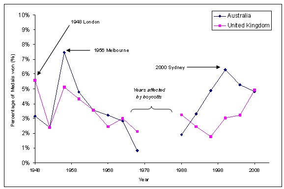
But should we really be surprised by the British successes at the 2008 Olympics? Over the last few years in the lead-up to the London 2012 Games, there has been a massive influx of money in the UK into Olympic sports and infrastructure. Australia showed a similar improvement ahead of the 2000 Sydney Games, with an improved performance in 1996 leading up to Australia's best Olympic result since 1956 — a Games also hosted by Australia in Melbourne. Since 2000, Australia's performances have declined.

It would seem that hosting the Olympics has an effect not only on how the host country performs at the hosted Games, but at the Games before them.

Looking at the results of the Olympic Games since World War II, we can see that the UK and Australia recorded their best results in their home Games, and their results declined in the following years. We have removed the 1980 (hosted by the USSR) and 1984 (hosted by the US) Games, as boycotts by the US (in 1980) and the USSR (in 1984) — the two big Olympic players before the rise of China — disturb the results.

Graph of Olympic performances

The percentages of medals won by the UK and Australia between 1948 and 2008.

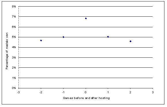
Extending this analysis to all countries that have hosted Games post WW2 (excluding 1984 and 1988), we can see quite clearly that as a country builds towards its home Games, its results improve. In the Olympics following the hosted Games, the results trend downwards. The following chart shows the average performance of the home country in terms of the percentage of medals on offer that were won. Each country is evenly weighted.

Average medal counts

Percentage of medals won by the host nation, averaged over the years in question.

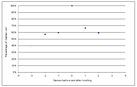
Another way of looking at this is to compare a country's results to its home success. Scaling the home results to 1, we can see that a country's success two Games before hosting is just under 60% as good as the home result. This increases slightly the Games before hosting. The home result is roughly 1.5 times as successful as the Games immediately preceding and following. This method is perhaps more accurate than a direct look at medal count (or the percentage of medals won), as this result is largely influenced by the US, which overpowers the results of smaller countries, such as Mexico.

Home results compared to previous and subsequent games

Home results compared to results from previous and subsequent Games.

Of the thirteen countries to host post WW2 Olympics, only Canada and Finland have failed to achieve their best post-war results when they were host (discounting the boycotted 1980 and 1984 Games). Finland achieved its best result one Games before being host. Australia's 2000 Sydney result is only surpassed by its 1956 Melbourne result.

What about gold medals?

The official Olympic rankings are determined by gold medal count, as opposed to the total medal count we have used here. The reason we have used total medal count is simply because it gives us more data and is more representative of a country's achievements. But what about gold medals? Does hosting the Games boost your gold haul?

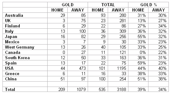
The following data shows the gold medals and total medals won home and away in the post WW2 era (without those boycotted years), and also the gold percentage of the total medal count:

Medal table

Gold medal count. See below for a caveat concerning West Germany.

Ten out of the thirteen countries who have hosted post WW2 Games have a higher percentage of gold medals as part of their overall haul when at home compared to when away. Overall, 39% of the home country's medal haul is gold, compared to 34% when away.

So what next for the UK?

If these results are to be believed, there will be more misery for Australia in 2012, who will be beaten quite easily by the UK. If the Poms increase their medal share by a factor of 1.5, then they will claim around 7.4% of all medals on offer in London. Judging by past results, this will be put them either in 3rd place, if they can sneak past the Russians, or 4th place in the overall medal tally. The UK should also increase their gold medal share.

The 2012 Olympic programme features 26 sports in a total of 39 disciplines. It's difficult to determine in advance how many medals will be awarded in a Games, but going on the Beijing numbers (302 gold, 303 silver and 353 bronze medals awarded — 958 in total), our bold prediction for the British team is...

...70 medals, including 30 golds.

Australia's results will be largely free of any hosting benefits it gained in 2000. It must be about time to bid again! (And apparently we are.)

Mathematical disclaimers

  • We have limited data — 14 Games. The reason we have chosen to look at the years post WW2 is that before WW2, the Olympic Games were not well attended simply due to the costs of sending a team overseas. Also, as it was so much easier, comparatively, for the home team to send athletes to compete, the home team's performance was greatly enhanced — the US won 86% of the medals on offer at their home Olympics in 1904.
  • There are many other factors affecting a team's performance. These include the amount of money spent on the team and the country's population. Plus has taken a look at some of these ideas in the article Harder, better, faster, stronger.

  • As in all systems, there are unexpected results. When Montreal hosted the Olympics in 1976, Canada won zero gold medals!
  • West Germany merged with East Germany for the 1992 Games. I only looked at the West German results for this analysis, as it is impossible to be consistent after its merge with the East.
  • When examining the medal share of countries before and after their host Games, only years not interrupted by the boycotts were examined.
  • There is always the chance that the UK simply over-performed in 2008...

Games examined

1948 Great Britain, 1952 Finland, 1956 Australia, 1960 Italy, 1964 Japan, 1968 Mexico, 1972 West Germany, 1976 Canada, 1988 Korea, 1992 Spain, 1996 US, 2000 Australia, 2004 Greece, 2008 China.

Marc on science and cricket over at the Brains Matter podcast

If you like your science podcasts and love your cricket, then get over to Brains Matter to hear me on the other end of an interview talking about science, psychology and cricket - Ep 84: The Science and Psychology of Cricket - Part 1.

This interview arose from two articles I wrote on science and cricket - the first for All Out Cricket in 2007 (posted on Mr Science as Science, Psychology and Cricket), and the second for Plus Magazine (posted on Mr Science as The curse of the duck).

To listen to the experts consulted for the first story - Dr Rob Duffield from the School of Human Movement at Charles Sturt University, and Dr Alistair McRobert from Liverpool John Moores University - check out the story and podcast I put out in 2007.