Tuesday, 18 March 2014

Cricket is a matter of life and death

A guest post by Bernard Kachoyan

Ever thought of batting as a life and death struggle against hostile forces? It always seemed that way when I batted. Well you might be more accurate than you think.

The experience of a batsman can be described as a microcosm of life: when you go out to bat you are “born”, when you get out you “die”. But what happens when you are Not Out (NO)? More subtly, when you are Not Out you simply leave the sample pool, that is you live for a while then you stop being measured. In the parlance of statistics, this becomes “censored” data. In medical research the “born” moment is equivalent to when a patient is first being monitored (e.g. survival times of cancer patients after diagnosis). The question in medicine becomes, what is the “survival function”, the probability that a patient survives for X years after the start of observation? And how does the life expectancy curve of one population differ from another, in particular are people treated in a particular way different to a control group).

These type of problems are commonly addressed using Kaplan-Meier (KM) estimators. In economics, it can be used to measure the length of time people remain unemployed after a job loss. In engineering, it can be used to measure the time until failure of machine parts. Here we will apply those ideas to batting in cricket.

An important property of the KM estimate is that it is non-parametric in the sense that it does not assume any type of Normal distribution in the data, something which is patently untrue for this type of data. It also only uses the data itself to generate a survival curve (the term given to the survival function after it is drawn on a chart) and associated confidence limits. Hence the KM survival curve may look odd in that it declines in a series of steps at the observation times and the function between sampled observations is constant. However, when a large enough sample is taken, the KM approaches the true survival function for that population.

An important advantage of the KM method is that it can take into account censored data, particularly censoring if a patient withdraws from a study, i.e. is lost from the sample before the final outcome is observed. This makes it perfect for dealing with the NOs as described above.

When referring to batsmen, “death” means getting out, being “censored” means completing the innings before getting out (remaining NOT OUT) and “time” means number of runs scored (tj = scoring j runs). The idea of the KP estimator is pretty simple.
  1. The conditional probability that an individual dies in the time interval from ti to ti+1, given survival up to time ti is estimated as di/ni where di is the number who die at time ti, and ni is the number alive just before time ti, including those who will die at time ti
  2. Then the conditional probability that an individual survives beyond ti+1 is (ni – di)/ ni
  3. When there is no censoring, ni is just the number of survivors just prior to time ti. With censoring, ni is the number of survivors minus the number of losses (censored cases). It is only those surviving cases that are still being observed (have not yet been censored) that are "at risk" of an observed death
  4. The KP estimator of the survivor function at time t for tj ≤ t ≤ tj+1 is then formally:


Such KM curves have attractive properties, which perhaps explain their popularity in medical research for over half a century. They are fairly easy to calculate and they provide a visual depiction of all of the raw data—including the times of actual failure, yet still give a sense of the underlying probability model.

Let’s now apply the KM estimator to some cricket statistics. In this case I have arbitrarily chosen the batting statistics of Steve Waugh, Sachin Tendulkar (up to 2010 to keep roughly the same number of innings as Waugh) and Don Bradman. Without the consideration of the censored data (the Not Outs), then the curve simply reverts to the percentage of scores less than or equal to a certain number of runs - the value on the x axis. This is shown in Figure 1. Bradman of course is still clearly in a class of his own.

If we now properly include the NOs in the formulation we get survival curves as shown in Figure 2. I have omitted the Tendulkar curves here for clarity. As expected, the survival rates go up as the NOs do not indicate a true “death”. In Steve Waugh’s case, the increase is noticeable (I didn’t say “significant”!) since he has a large number of NOs compared to most batsmen within his number of test innings.

This is shown more starkly in Figure 3, where I have plotted both the censored and uncensored curves for Waugh and Tendulkar. I have plotted them on a logarithmic scale to highlight differences. It can be seen that Waugh’s censored survival curve (cf the raw curve) tracks Tedulkar’s very closely until a score of about 100. This reflects the large number of Waugh’s NOT OUTS (43 vs 29 in roughly the same number of innings, 260 vs 278). The diversity of the curves after that not only reflects the propensity of Tendulkar to go on to big scores, but also that a large number of Tendulkar’s not outs were after he had already scored a century (15 vs 2 for Waugh).

      
Figure 1 and Figure 2

 
Figure 3

The basic KM methodology has been around since the 1950s and of course has been extended in various ways by professional statisticians and alternative methods proposed. But their simplicity means it is still widely used.

There are several drawbacks, some of which can be seen in Figures 1-3. Firstly, the vertical drop at specific times is drawn from the data, and should not be seen as indicating particular “danger times”. This is particularly evident at larger scores where the naturally small sample size means that three are fewer data points (i.e. scores where a batsman actually gets out). So some sort of smoothing of the curve is thus necessary to provide an estimate of the true underlying functional dependency.

This reduction on the sample at large values also means the effect of each individual failure on the size of the step-down increases.

Another drawback of the KM method is that the estimate of the probability of surviving each “danger time” depends only on the number of patients at risk at that time. So if there are censored values the actual time between the last failure and the time of censoring is not considered.

It is natural at this point to question the underlying assumption of the KM method that the patients (i.e. innings) are independent. Is it common to talk in cricket about form slumps or purple patches. This can be examined statistically by considering the autocorrelation function of the scores, shown in Figure 4 assuming stationarity, where Waugh has been omitted for clarity. The figure clearly shown no evidence for time/innings correlation and although strictly speaking un-correlation does not imply true independence, it is evidence that the innings can be considered independent for the purposes of this analysis.

 
Figure 4

The question naturally arises is whether we can say anything statistically about whether the difference between survival curves is significant (cf treated vs control groups in medicine). Confidence intervals can be placed on the derived curves using the so-called Greenwood formula, dating back to the 1920s, or its more modern variations. These will suffer the drawback of being less accurate in the tail of the curves, where by definition the sample size is smallest. Not only will the formulas return a greater error because of that, the validity per se comes into question as the expressions rely on a normal approximation (through the central limit theorem), hence can only be considered valid for remaining innings bigger than say 20 or so.

Unfortunately, as we have seen above it is in the tails of the curve where the distinctions between very good and great batsman are often found.

Similarly a number of ways of comparing curves exist in the statistical literature, such as Kolmogorov–Smirnov test, the Log-rank test or the Cox proportional hazards test. These can rapidly become very mathematically complicated, especially if we want to try and distinguish one part of the curve specifically (say the high end).

Although I haven’t done the hard yards in this article, my intuition tells me we might be hard pressed to prove statistically significant differences between the Waugh and Tendulkar corrected survival curves. This is the drawback of applying statistical tests into areas where their applicability is not clear.

In any case, it can be seen that batting can most certainly be considered a true life and death struggle.

Friday, 14 March 2014

What to do with old swimming caps


Since the start of the 2013/2014 ocean swimming season, around 20,000 swimming caps have been handed out to competitors at the various ocean swims in NSW. If you are a regular ocean swimmer, it doesn’t take too long before you have more caps than you know what to do with. Some may be used again in the pool, and some given to friends and family, but the vast majority of these caps will end up in land-fill having spent most of the season at the bottom of your swimming bag.

This year at the 2014 Coogee Island Challenge, we are running a swimming cap “amnesty”. Bring down your old caps that you no longer use, or donate after your swim, and we will save your caps from an ignominious end in land-fill or as rubbish scattered on the beach. There are no companies that recycle swimming caps, mostly made of latex or silicone, so the collected caps will be donated to the following organisations for re-use (which is better than recycling anyway):
  • The Frugal Forest is a One Off Makery project, supported by Midwaste, the Australia Council for the Arts and Glasshouse Port Macquarie. Drawing in artists, musicians, scientists, community, business and industry, we aim to build an intricately detailed forest entirely from salvage. Why? Because nothing is wasted in the forest, and we could really learn from that.
  • Reverse Garbage is Australia’s largest creative reuse centre, committed to diverting resources from landfill – approximately 35,000 cubic metres or 100 football fields’ worth per year. Almost 40 years from its founding, Reverse Garbage is now an internationally recognised, award-winning environmental co-operative committed to promoting sustainability through the reuse of resources, as well as providing support to other community, creative and educational organisations. 
  • Various Council Pools to be used by those needing a cap on the day.
Where: Coogee Island Challenge Ocean Swim, Coogee Beach
Where, specifically: The oceanswims.com marquee.
When: 13 April 8.30-11.30am

There seems to be a gap in the market here for an entrepreneurial organic chemist. Swimming caps are usually made from latex or silicone (rubbery materials) which are polymers. Are there any options at all for recycling such materials? From what I read, it's just not economical, but I wonder will that change as the raw starting materials for such products (that is, petroleum) become rarer and so more expensive.

Tuesday, 11 March 2014

Ep 153: Complex Network Analysis in Cricket


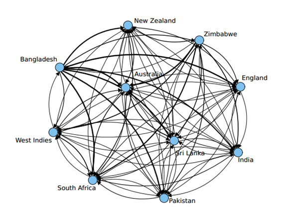
Complex network analysis is an area of network science and part of graph theory that can be used to rank things, one of the most famous examples of which is the Google PageRank algorithm. But it can also be applied to sport. Cricket is a sport in which it is difficult to rank teams (there are three forms of the game, the various countries do not play each other very often etc.), whilst it is notoriously difficult to rank individual players (for how the ICC do it, see Ep 107: Ranking Cricketers).

Satyam Mukherjee at Northwestern University became a bit famous when The economist picked up his work (more famous than when we picked it up!) and he has published extensively on complex network analysis as applied to cricket rankings. I had a very interesting chat with Satyam about his various works concerning the evaluation of cricket strategy, leadership, team and individual performance, and the papers we discuss in the podcast are listed below. One of the more interesting findings was that left-handed captains and batsmen are generally ranked higher than their right-handed counterparts, whilst this is not true for left-handed bowlers.

Tune in to this episode here:


Songs in the podcast:
References:  
  • Satyam Mukherjee (2013). Ashes 2013 - A network theory analysis of Cricket strategies arXiv arXiv: 1308.5470v1  
  • Satyam Mukherjee (2013). Left handedness and Leadership in Interactive Contests arXiv arXiv: 1303.6686v1  
  • Satyam Mukherjee (2012). Quantifying individual performance in Cricket - A network analysis of Batsmen and Bowlers arXiv arXiv: 1208.5184v2  
  • Satyam Mukherjee (2012). Complex Network Analysis in Cricket : Community structure, player's role and performance index arXiv arXiv: 1206.4835v4  
  • Satyam Mukherjee (2012). Identifying the greatest team and captain - A complex network approach to cricket matches arXiv arXiv: 1201.1318v2

Thursday, 20 February 2014

instascience

#instascience is a project by @kip_stewart and @kickstartphysics which involves short, sharp science videos on instagram. Here are a couple of videos, it's worth checking out.

Monday, 10 February 2014

World beer consumption and scientific productivity


The above is posted without any commentary from me and comes from a site called figshare. This site is part of the open data movement, which posits that scientific data should be available for everyone to analyse and then draw their own conclusions. Hence, I leave it to you to follow the references, grab the data and see what you think - you might like the keep in mind the idea that correlation does not equal causation - there might just be something driving both GDP and beer drinking.

References:

Christopher J. Lortie (2010). Letter to the Editor: A global comment on scientific publications, productivity, people, and beer Scientometrics DOI: 10.1007/s11192-009-0077-z  

Christopher Lortie (2013). World beer consumption & scientific productivity figshare DOI: 10.6084/m9.figshare.664162

Friday, 31 January 2014

arXiv trawl: January 2014 - Social Media


An interesting way of keeping your ear to the ground regarding the latest happenings in the scientific world is to monitor the arXiv. The arXiv (pronounced "archive”) is a repository for electronic preprints of scientific papers. Scholarly peer review of scientific papers can take a long time, so many scientists use archives like this to share their findings and to seek comment on their work before official publication. As such, the content of the arXiv is many and varied; there are weird and wonderful topics, and papers in various states of review. Some will never get published anywhere else, whilst others are seminal (for example, Perelman’s proof of the Poincare conjecture). But by the very definition of preprint, they are all calling for comment. I dived in recently, and here are some highlights of the last few months on the arXiv concerning social media.

Because MySpace --> Facebook

Researchers from Princeton, in the report Epidemiological modeling of online social network dynamics, modelled the rise and fall of MySpace by likening it to a disease and used epidemiological methods to model how it infected the population, and how the population eventually became immune. The number of times the term “MySpace” was searched for in Google was used as a measure of the site's popularity (or how infected the population was). This data was sourced from Google Trends. If you would like to read more about the maths involved, check out Sick of Facebook? Read on… in Plus. As you can see below, they fitted a nice curve to the data. Cute.


All good so far. Stories concerning social media are favourites of conventional media, and naturally this was picked up: Facebook could fade out like a disease. What the newspapers focused on was the work fitting the epidemiological model to Facebook data (Google searches for “Facebook”) and the conclusion that Facebook is heading for a "rapid decline", and between 2015 and 2017 will lose 80% of the users.

There are two questions that arise from this:

1) Is Google Trends data a good measure of the popularity of a website?
2) Just because the MySpace data fits this curve does not mean Facebook will.

Facebook was made aware of this study, and their reply was pretty excellent. They did their own study using Google Trends on searches for "Princeton" and found that:

“Princeton will have only half its current enrollment by 2018, and by 2021 it will have no students at all, agreeing with the previous graph of scholarly scholarliness. Based on our robust scientific analysis, future generations will only be able to imagine this now-rubble institution that once walked this earth.

While we are concerned for Princeton University, we are even more concerned about the fate of the planet — Google Trends for "air" have also been declining steadily, and our projections show that by the year 2060 there will be no air left.”


Thanks to FlowingData for the link to Facebook's reply.

It’s also a nice example of a study that will never be followed up by the conventional media. Even if this work makes an entirely accurate prediction of Facebook’s future, there will be no follow up newspaper article in 2020.

How to get yourself retweeted, sort of

Everybody likes to be popular. To this end, Ronald Hochreiter and Christoph Waldhauser authored A Genetic Algorithm to Optimize a Tweet for Retweetability in which they look at the factors that make a tweet popular. They developed a Twitter-like network of connected people and pushed tweets into the network to see which ones were retweeted. They modified the tweets each time they ran the simulation using a genetic algorithm. These algorithms work like evolution. Each tweet had a number of “chromosomes” that were modified with random mutations each time the model was run, with those mutations that brought about better results (that is, more retweets) kept, and those that didn’t, further randomly mutated. The chromosomes of the tweet concerned the polarity of the tweet (I think this means whether it’s positive or negative, it’s not well explained), how emotional the tweet is, the length of the tweet, the time of day it’s sent, and the number of URLs and hastags contained.

So how should you compose your next tweet? Well, unfortunately the paper doesn’t really say. It shows some results that don’t translate particularly well into reality. Their conclusions are that the genetic algorithm works pretty well, and that more work is needed. Fair enough, there are plenty of papers out there that simply outline how a new model works rather than having exciting results; I’ve written a few myself.

Don’t share your mobile phone number on social networks

Call Me MayBe: Understanding Nature and Risks of Sharing Mobile Numbers on Online Social Networks wins this month’s award for best reference to a pop song in a scientific paper title. The researchers examined how sensitive personal information spreads around social networks by collecting 76347 unique mobile numbers posted by 85905 users on Twitter and Facebook. They then used these mobile numbers to gain sensitive information about their owners from other social networks.

This in itself is an interesting study of how easy it is to collect personal information online, but they didn’t leave it there. They then communicated the observed risks to the owners by calling them up with the mobile numbers they found. Some users were surprised to know about the online presence of their number, while others had intentionally posted it online for business purposes. They found that 38.3% of users who were unaware of the online presence of their number had posted their number themselves on the social network.

Where’s my hoverboard?

Searching the Internet for evidence of time travellers makes the bold claim in its abstract that, regarding the search for time travellers online, it is “perhaps the most comprehensive to date”. Essentially what they did was search the web for information that shouldn’t have been known at the time of publishing – only time travellers from the future could have possessed such prescient knowledge. The two events they were looking for evidence of were the viewing of Comet ISON and the inauguration of Pope Francis – both big events that people in the future would know and care about. To do this, they needed to look for information published before these events occurred. They found that Bing and Facebook were no good for this study as they didn’t make clear at what date the information was published, or the date could be easily edited. So they used Twitter, on which tweets are nicely time-stamped. They called for time travellers to use the hashtag #ICanChangeThePast2 in September 2013 and looked at tweets before this time. They also examined Google Trends for searches a time traveller might have made.

Disappointingly, they found no evidence that any time travellers concerned themselves with posting on twitter or doing google searches.

I am going to go for a run before I press publish on this post. So, if there are any time travellers out there, come and join me at Erskineville Oval at 1pm Thursday 30th January.

(Edit: There were two people and a dog down at the oval. The dog chased and barked at me in a very knowing fashion. The time-travellers of the future are apparently long haired, short brown dachshunds.)

References:
  • John Cannarella, & Joshua A. Spechler (2014). Epidemiological modeling of online social network dynamics. arXiv: 1401.4208v1
  • Ronald Hochreiter, & Christoph Waldhauser (2014). A Genetic Algorithm to Optimize a Tweet for Retweetability Proceedings of MENDEL 2013: 13-18. 2013. arXiv: 1401.4857v1
  • Prachi Jain, & Ponnurangam Kumaraguru (2013). Call Me MayBe: Understanding Nature and Risks of Sharing Mobile Numbers on Online Social Networks. arXiv: 1312.3441v1  
  • Robert J. Nemiroff, & Teresa Wilson (2013). Searching the Internet for evidence of time travelers. arXiv: 1312.7128v1

Thursday, 16 January 2014

I think you've had enough, Mr. Bond

James Bond is likely to be impotent, at high risk of liver disease, and the fact he likes his martini "shaken, not stirred" is because of alcohol-induced tremors.

If you weren't already convinced that a real-life James Bond would be a terrible spy - he tells people his actual name for goodness sake - the article Were James Bond’s drinks shaken because of alcohol induced tremor? outlines the likely health issues Britain's most famous fictional spy would be suffering in real life due to his outrageous alcoholism.

The researchers read all 14 James Bond books and noted down each time he had a drink, and how much. They also noted when he was unable to drink - for instance, when incarcerated. Not including the days when he was unable to drink, they found his weekly alcohol consumption to be 92 units (standard drinks in Australia - 10 ml of pure alcohol), over four times the recommended amount. His maximum daily consumption was 49.8 units. Out of the 87.5 days he was able to drink, he only had 12.5 alcohol free days.

This type of behaviour is not consistent with his Lothario character, given that his sexual function is likely to be severely impaired by his drinking. It's also not particularly consistent with his ability to shoot straight outside of the bedroom, where sobriety is a necessity to defeat the bad guys. On the other hand, drinking is likely to have decreased his risk aversion, and previous studies have shown that drinking encourages unsafe sex.

But before you become too crushed by the fact that a fictional hero might not actually be scientifically sound, perhaps Bond is smarter than the authors of this report suspect. A 1999 report Shaken, not stirred: bioanalytical study of the antioxidant activities of martinis found that shaken martinis have superior antioxidant activity and this could have decreased his risk of cataracts and cardiovascular disease. There is hope. I don't feel as bad as I did when I discovered that Santa Claus is a fat, diabetic drunk.

Here's Bond in drinking action in Casino Royale.


And here's a handy infographic:


References:  
Graham Johnson, Indra Neil Guha & Patrick Davies (2013). Were James Bond’s drinks shaken because of alcohol induced tremor? BMJ DOI: 10.1136/bmj.f7255  

Trevithick CC, Chartrand MM, Wahlman J, Rahman F, Hirst M, & Trevithick JR (1999). Shaken, not stirred: bioanalytical study of the antioxidant activities of martinis. BMJ (Clinical research ed.), 319 (7225), 1600-2 PMID: 10600955

Thursday, 26 December 2013

Have you lost a spoon at work?

Doing my annual Christmas clean of my kitchen, I found 7 forks, 4 spoons and 1 knife that I never bought. Where on Earth did these spoons come from? Is my kitchenware breeding and evolving? On the other hand, my cutlery always goes missing from work, so much so that I have stopped keeping it in communal areas.

A 2005 paper, The case of the disappearing teaspoons: longitudinal cohort study of the displacement of teaspoons in an Australian research institute, casts a light on my problem. It set out to determine the overall rate of loss of teaspoons in a research institute of 140 people and whether how quickly they disappear depends on the value of the teaspoons or type of tearoom. They conducted a longitudinal cohort study by placing 70 discreetly numbered teaspoons in tearooms around the institute and observed the results over five months.

They found that 56 of the 70 teaspoons disappeared during the five month study. The half life of the teaspoons was 81 days, with the half life of teaspoons in large communal tearooms (42 days) significantly shorter. At this rate, an estimated 250 teaspoons would need to be purchased annually to maintain an institute-wide population of 70 teaspoons.

So it looks like I may have contributed to this problem at my workplace. On the other hand, a percentage of my own cutlery must now be in the kitchens of my workmates.

References:

Megan S C Lim (2005). The case of the disappearing teaspoons: longitudinal cohort study of the displacement of teaspoons in an Australian research institute BMJ DOI: 10.1136/bmj.331.7531.1498

Determining the best cricket team of all time using the Google PageRank algorithm


My plan for each summer holiday is pretty simple. It involves BBQs, the ocean, and watching the cricket. This summer we are being treated to an Ashes series, that at the time of writing, Australia has already won convincingly. England were regarded as favourites for this series and Australia has performed well above expectations. But how good are these teams compared with teams of the past?

Satyam Mukherjee at Northwestern University has come up with a novel approach to ranking cricket teams. In his paper, Identifying the greatest team and captain—A complex network approach to cricket matches, Mukherjee uses the Google PageRank algorithm to rank the various Test (and One Day International) playing countries, and also the team captains. PageRank works by counting the number and quality of links to a page to determine how important the website is. The underlying assumption is that more important websites receive more links from other websites. What Mukherjee has essentially done is instead of tracking links, he has tracked team wins, so that an estimate of a team's quality is made by looking at the quality of teams it has defeated. 

After considering all Test matches played since 1877, and all One Day International matches since 1971, Mukherjee identified Australia as the best team historically in both forms of cricket, Steve Waugh as the best captain in Tests, and Ricky Ponting in ODIs. With regards to captains, it is hard to conclusively prove that it was the captain's influence that made them good teams - Australia under Waugh and Ponting were formidable and pretty much anyone could have captained them. This ranking method also only compares teams against their contemporaries. That is, it is not saying that Waugh's team was better than, say, Bradman's 1948 team. It is saying that Waugh's team was further ahead of the rest of the world than Bradman's was in 1948. Unless you have a time machine, it is very difficult to compare across era.

You can read more about how the Google PageRank algorithm works in The amazing librarian, and check out our previous article on sporting ranking systems for chess and sumo wrestling.

This is of course not the first study to apply objective science to a subjective topic within cricket. In the paper The effect of atmospheric conditions on the swing of a cricket ball, researchers from Sheffield Hallam University and the University of Auckland debunk the commonly held belief that humid conditions help swing bowling. But they don't discount the theory that cloud cover helps.

They used 3D laser scanners in an atmospheric chamber to measure the effect of humidity on the swing of a ball, and found that there was no link between humidity and swing. They postulate at the end of the paper that cloud cover may have an influence on swing. Cloud cover reduces turbulence in the air caused by heating from the Sun and they theorise that still conditions are the perfect environment for swing. When a ball moves through the air, it produces small regions of slightly higher and lower pressure at various points around it. This causes the ball to swing. If the air is already turbulent, it is more difficult to sustain these regions and so therefore there is less swing. Imagine throwing a stone into a still lake - the ripples around where the stone lands are easy to spot and move for some distance. Compare this to throwing a stone into an already turbulent ocean - you can barely spot the ripples as the turbulence in the water is much greater than any effects from throwing the stone.

If you think about the places where swing bowling has been most effective - England, New Zealand, Hobart - this theory appears sound, however more study is needed to prove it. So I'll endeavour to watch as much cricket as I can this summer, in the name of science.

References:
Satyam Mukherjee (2012). Identifying the greatest team and captain—A complex network approach to cricket matches Physica A: Statistical Mechanics and its Applications DOI: 10.1016/j.physa.2012.06.052  

David James (2012). The effect of atmospheric conditions on the swing of a cricket ball Procedia Engineering DOI: 10.1016/j.proeng.2012.04.033

Saturday, 28 September 2013

Ep 152: Spiderman Part 2


In part 2 of the Spiderman series, Dr Boob looks at the amazing properties of spider silk and how Peter Parker might harness various technologies to appropriately use it.

It's the final show from Dr Boob for a while and we will miss him greatly! But he's not disappearing completely - show him you care over on twitter - @doctor_boob

Tune in to this episode here.


Cover by Nippoten
Songs in this episode:

Sunday, 15 September 2013

Ep 151: Spiderman Part 1


This is our last Science of superheroes for a while so we thought we'd look at one of the big guys. Over two episodes, Dr Boob examines Spiderman and in episode one, he specifically looks at how to manipulate Peter Parker's DNA using a virus to transport engineered DNA into his cells. It is by changing his genetic structure that we can allow him to have his superhero abilities, which for Spiderman are largely exaggerated spider traits as well as something called a "Spidey sense".

Tune in to this episode here.


Cover image from NanAmy-BoT
Songs in the podcast by:

Modelling an all-time greatest musical playlist


The popularity of Triple J's annual Hottest 100 has made my wonder what my favourite songs of all time are and whether I could come up with a list based on some actual data. The information I have to use is my iTunes data since 2005. Being only 8 years of my life, this data set is limited. But with any luck (that is, if the assumptions hold true) the following algorithms will stay appropriate into the future and require only minor tweaking. What we're trying to do is come up with a method that will tell me, from my listening habits in iTunes, what my favourite songs are. Whether you actually listen to your favourite songs more than others is a debate for another time.

iTunes doesn't tell you when songs were played, just how many times, so the useful parameters we can export for each song are "Play Count" (p) and "Date Added". If we add up all the individual play counts, we get the "Total Play Count" for the entire collection (P). Date Added can be turned into the number of days the song has been in the collection - time (t). We also know the number of songs in the collection now (N) and at various times in the past when I've exported the data.

First cut:
An easy first-cut model is to simply divide each song's play count by its time in the collection and order the songs by this rate of play. As a first attempt this may seem logical, however the problem is that it is heavily biased towards newer songs. You're likely to listen to a song a few times after you add it before it slips back into your various playlists. It also doesn't take into account that there are more songs in the collection now than at the start.

What we need to do is come up with an equation that tells us how many times a song is expected to have been played depending on when it was added. We can then compare this number to how many times it was actually played and order the songs by this ratio.

Second cut:


This second version suffers from the same biasing problem as the first, but does take into account that the number of songs in the collection is changing over time. This is important as if you assume that you listen to music for about the same amount of time each day, then the more songs you have in your collection, the less likely you are to randomly hear the same song twice. Hence, songs that are played regularly when the collection is small should not be treated in the same way as songs played with the same frequency when the collection is large. N0 is the number of songs in the collection at t0. This model assumes that the number of songs in the collection grows linearly over time (A and B are constants) - that is, the same number of songs are added each month. This is about right for my collection. The integration is left as an exercise for the reader (hint, you get a log function).

Third cut:


This final version takes into account that when you add new songs to your collection that you like, you are likely to listen to them quite a lot, independently of the number of songs that are already there - that is, they get added to a "new songs" playlist. The novelty of a new song eventually wears off, so the way we've modelled this is to use an exponential factor. You can tweek the coefficients (C and D) by thinking about the "half life" of a new song. The integration is left as an exercise for the reader (hint, you get a log function and an exponential).

The equation now contains two components - the first modelling the number of plays expected through random play and the second the impact of adding new songs to the collection. The model suggests that I play the same number of songs each year (apart from a barely perceptible increase due to the exponential factor) and it seems to work pretty well. This model won't work if and when I swap over to streaming music, as opposed to owning it, as my major form of music consumption, but for now it's holding up. Having played around with the coefficients, the list as it stands is below. It pretty much represents upbeat songs I go running with and songs my 2-year old likes - for whatever reason, he likes Korean pop music! I have to think that the novelty of Psy will wear off over time, but Hall and Oates, they'll never die.

Gangnam Style PSY
I Remember Deadmau5 and Kaskade
ABC News Theme Remix Pendulum
You Make My Dreams Hall & Oates
Shooting Stars Bag Raiders
This Boy's In Love The Presets
Get Shaky Ian Carey Project
Monster BIGBANG
From Above Ben Folds
Banquet Bloc Party


Monday, 15 July 2013

And introducing...


And introducing to the world, Hazel Clara West. We're all very happy! She's the baby by the way if there was any doubt... She has a proud big brother.

Sunday, 14 July 2013

Ep 150: Bryan Gaensler at 20 years of the Sydney University Science Talented Student Program

I recently attended the 20 year anniversary of the Sydney University Faculty of Science Talented Student Program. That was an intimidating event! The evening was hosted by Adam Spencer and featured an in-conversation with Professor Bryan Gaensler, Dave Sadler (Bryan's former mathematics high school teacher) and Alison Hammond, a current TSP student. The kind people at the Sydney Uni Faculty of Science have allowed me put the audio up here, so a big thanks to them - all attribution, love and praise should be sent their way. It was a very interesting evening to hear what encouraged one of Australia's most well-known scientists into astrophysics, along with the always witty Adam Spencer. Tune in to this episode here.


The two songs used in this episode are by Keytronic / CC BY-NC 3.0 and Jeris / CC BY-NC 3.0

Saturday, 4 May 2013

Ep 149: Zombies Part 2

In the second of a two part series on zombies, this week we go deeper in the dark world of the undead. In part one we managed, through a combination of drugs, to create zombie-like creatures who were sluggish and largely brain-dead. This week we have a shot at recreating the zombies of films such as I am Legend - creatures created through the transmission of a virus, who are filled with rage and enjoy the taste of brains. Topics covered include:
  1. Mad cow disease and the use of prions to transmit disease,
  2. Chimpanzees who eat brains,
  3. Methamphetamines for the creation of rage,
  4. Mathematical modelling a zombie pandemic and how the zombies could do this sustainably.
Somehow we ended up proposing a "Planet of the zombie apes" movie idea, and a methamphetamine-infused biodome. It might not pass an ethics committee. Tune in to this episode here.


In the podcast we use a few songs, all licensed under a Attribution Noncommercial (3.0)
I As We by Speck
Big John by copperhead 
What It All Boils Down To by texasradiofish
Creative Commons License

Above image from ABC Open Wide Bay

Tuesday, 12 March 2013

Ep 148: Zombies Part 1


Zombies have been fodder for science fiction books and movies for years, but could we actually create one in the lab? And why indeed would you want to do this? Surely the whole "eating brains" concept would mean that making one is probably not in your best interests.

This week on the podcast, Dr Boob takes us on a journey through zombie science fiction, Haitian zombies and zombie-style animals in nature, including a fascinating scenario where ants are hijacked by a fungus. This episode is part 1 - next time we will tackle, among other things, brain parasites, eating brains (cultural, cooking and animals that do it), mad cow disease, the 'zombie' bath salts attacks (face eating), and a mathematical model of a zombie pandemic.

We have looked at zombies in the past. In the post Correlation of the Week: Zombies, Vampires, Democrats and Republicans we looked at how the political party of the US presidency seems to influence the style of science fiction movie made during their presidency. A recent upsurge in zombie films could augur well for the Republicans next time round, although there are still plenty of vampire films and TV shows around.

The song at the end of the podcast is by copperhead / CC BY-NC 3.0

Tune in to this episode here.

Ep 147: Time Travel and the movies part 2

Time travel is one of the more interesting plot devices in scifi movies. In this episode and the second in the series, Dr Boob takes us on a journey through parallel universes, causal loops and the nature of time-lines. We look at Back to the Future, the Terminator series, Futurama, Looper, Red Dwarf and Twelve Monkeys. By the end, it got a bit deep and my brain hurt! There are a few spoilers in this episode, if somehow you haven't seen these classic time travel movies. And please excuse my cold!

A good reference for attempting to explain the logic of time travel in the movies is Temporal Anomalies in Time Travel Movies.

Tune in to this episode here.

Thursday, 10 January 2013

Marathon finishing times

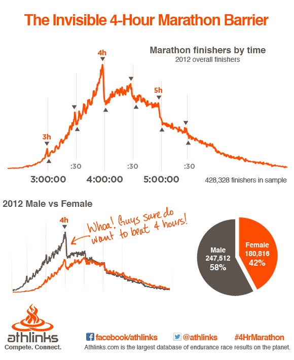
Statistical distributions arising from sporting events are a nerdy love of mine, so I found this chart form athlinks particularly interesting. They analysed marathon results from 2012 and found a number of invisible time barriers. You can read their original post on facebook and join their conversation.


The distributions show the psychological effects of goal times. The most striking are at 4 hours and 5 hours, with the sharp drops on the hour suggesting that a lot of runners are aiming at just beating that particular time. Indeed, if I ever ran one, I would probably be aiming at 4 hours, or more likely 4 hours 30 minutes, which is a nice round number. In my first half marathon, I beat the 2 hour mark by only 15 seconds, and if it wasn't for a sprint at the in order to pip the 2 hour mark, I wouldn't have made.

What intrigues me is whether runners are really competing to their full potential. If you took away the clock, clearly you wouldn't have these invisible barriers - you'd have a nice smooth curve. But are runners performing better than they ordinarily would, or are they pacing themselves to hit certain times? Let me know what you think.

For a description of what drives the above curve (bar the invisible barriers), see this post I put together on an ocean swim I did - you can't see the clock in an ocean swim so the invisible barriers aren't apparent.

Friday, 24 August 2012

Ep 146: Time Travel and Movies Part 1

We still exist!

This week we're inhabiting the nexus of science, pop culture and science fiction. The topic of discussion is Time Travel and how it is portrayed in the movies. There's a little bit of philosophy, a little bit of physics, a dash of the paranormal, and a lot of Dr Boob, who is once again the driving force of this podcast!

If you are interested in Andrew Basiago and Project Pegasus, which is mentioned in this show, you can find more here. If you want to organise your own time traveller convention, or if you can think of a good experiment that BOOB could stand for, let us know.

This is part one of a two part series on time travel and the movies - part two will be out shortly. Tune in to this episode here.