Sunday, 29 July 2012

My Olympic Predictions

Over at Plus Magazine, I came up with a predicted medal tally for the London 2012 Olympics. Check out my Mapping the medals article if you are interested in the maths behind it.

My top 20 predicted countries (ordered by total number of medals) are:

2012 Predicted Position2012 Predicted Medals
United States1112
Great Britain279
Russia377
China476
Australia553
France642
Germany642
South Korea832
Ukraine929
Italy1028
Japan1125
Cuba1225
Belarus1321
Canada1419
Spain1419
Netherlands1617
Brazil1716
Kenya1815
Kazakhstan1815
Jamaica2012

And check out my interactive world map, where my predicted top 20 countries are coloured. If you click on each country, you will see results from previous games, a (semi-regularly) updated 2012 medal count, and some occasional comments.

Wednesday, 25 July 2012

Broadcasting on ABC Riverina

I have recently been doing a science segment with Chris Coleman on the morning show of ABC Riverina. If you are interested in listening to what we had to say, check out the following links:
We also done a couple of Olympics shows, which will be online soon. Listen in at about 9.45 am each Monday.

Saturday, 21 July 2012

Visualising Runs

Inspired by a recent post from Kasey Clark in which he plotted all his runkeeper runs (tracked via GPS) on a single map, I thought I'd explore my own running from the last few years and see how it might be visualised in an interesting manner.

Using his method, I exported all my runs as one big zip file of gpx files (found under your profile) then imported them all into Google Earth. Here is an image of all my runs around Sydney's inner west over the last few years. Most of the time I run along the Cooks River.


I also had a bit more fun with it, and for this you will need the Google Earth plugin for your browser - if you can see the following images you already have it, and if not then there should be a link for you to get it.

The city2surf is one of the world's biggest fun runs and I have done it the last few years. By creating a Google Earth tour, you can create an animation of your runs. I tweeked the gpx code in a text editor (and Excel) to make my 2010 and 2011 runs start at the same time, and then by using the tour gadget, you can embed the animation on your website. Perhaps over time I will add further year's runs to this animation. You'll need somewhere to host the exported kml files from Google Earth. There is a small lag at the start of the video and if it doesn't work, see the video on youtube. I'm looking to knock off that 2011 time this year in a few weeks! Edit 1: I have added a friend from 2010 and 2011.
The next tour doesn't look so great but it would look great in San Francisco or New York City. Google Earth has 3D buildings built in, and by turning these on, you can visualise your runs in 3D. The following shows my Bridge Runs across the Sydney Harbour Bridge and finishing at the Opera House. Runkeeper doesn't quite get the elevation of the bridge correct so it looks like I'm running across water. As mentioned, in cities where there are lots of rendered 3D buildings, this would look great. I haven't bothered yet to tweek the start times for each of the races to all be exactly the same as it's a bit fiddly, but you get the point. Again there is a small lag and if it doesn't work, see the video on youtube.
If you can't see the above videos, and the Google gadget seems really buggy, I have uploaded them to youtube and there you can see city2surf and bridge runs videos.

Tuesday, 17 July 2012

Swimming - technique, drag and strength

 
The 2012 Olympics are now only days away. I put together this article for Plus Magazine - check out the original article on Plus for full coverage, and follow Plus closely during the Olympics as they will be running regular sporting articles - see their package on maths and sport.

The men's and women's 100 metre freestyle swimming races are set to be two of the most glamorous events of the London 2012 Olympic Games. Much has been made of the swimming events for London 2012 because the previous 2008 Beijing Olympics saw an unprecedented number of new world records, due to the use of controversial swimsuits. Sixty-six Olympic records were broken during the 2008 Games – indeed, in some races the first five finishers beat the old Olympic mark – and 70 world swimming records were broken in total throughout the year 2008.

The controversial swimsuits have now been banned, but the records they set have not been revoked, so the 2012 Olympics are unlikely to see many new records. This does not mean, however, that the events will be any less competitive, and indeed if records are broken, the performances will likely be exceptional.

Pumping iron or beating drag?


Broadly speaking, records in all sports are determined by two factors: the physical and mental performance of the athlete and technological influence. Pure physical performance tends to improve over time as our understanding of the scientific aspects of sport lead to improved training techniques, diets and race tactics. Technological factors, such as a more supportive shoe, aerodynamic bike or faster car can also lead to quicker times. Some sports such as Formula One car racing have an obvious reliance on technology – notwithstanding the incredible physical and mental toughness required to withstand the cockpit of the F1 car. Other sports such as long distance running may have very little to do with technology, with famous examples of Kenyan runners winning major world events bare foot.

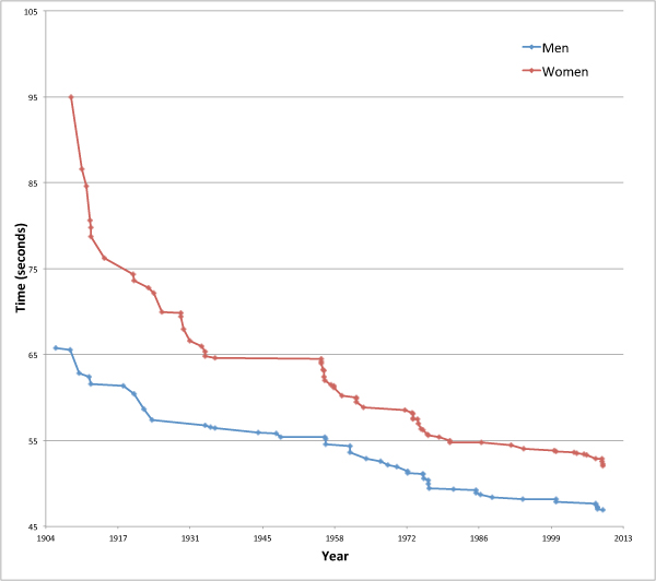
Although at first impression swimming seems to rely little on technology, there are many factors outside a swimmer's control that influence their final time. The type of pool has a considerable influence — the first four Olympics Games were not held in pools, but in open water (1896 in the Mediterranean Sea, 1900 in the Seine River, 1904 in an artificial lake). The 1908 Games were held in a 100 metre pool, whilst the 1912 Games were held in Stockholm harbour. The 1924 Olympics were the first to use a 50 metre pool with marked lanes, and the 1936 Games saw the introduction of diving blocks. Before the 1940s male swimmers wore full body suits that were heavy and caused a lot of drag. Pool designs have also changed with pool and lane width modified to eliminate currents, and energy absorbing lane barriers used to stop waves from adjacent lanes. (See below for a chart of world records over the 100 metre freestyle event since 1904.)

There are, broadly speaking, two things you can do to reduce your swimming time:
  1. Increase your power
  2. Reduce your drag
The magnitude $F_ D$ of the drag force acting on a swimmer moving in a fluid is given by the following equation

\[ F_ D=\frac{1}{2}\rho v^2 C_ D A, \]
where
  • $\rho $ is the mass density of the fluid
  • $v$ is the speed of the swimmer relative to the fluid
  • $A$ is the swimmer's cross-sectional area, that is the area of your body as it is pushing through the water head on
  • $C_ D$ is the drag-coefficient, a number which depends on factors such as the exact shape of the swimmer and the hydrodynamic qualities of their skin and what they are wearing.
Although it may seem like going to the gym and pumping some iron might be the obvious thing to do, reducing your drag is actually a speedier route to a quick lap time. Your power $P$ is the rate at which your body uses its energy, and when you are swimming the power you exert is proportional to the cube of your speed $v$

\[ P=F_ D v = \frac{1}{2}\rho C_ D A v^3. \]

Now suppose you want to increase your speed by 10%, from $v$ to $v+0.1v$. To do this solely by increasing your power, you need to exert a new power $P_1$
\[ P_1 = \frac{1}{2}\rho C_ D A (v+0.1v)^3. \]

The percentage increase in the power required is given by

\[ Increase = 100 \times \frac{P_1-P}{P}= 100 \times (\frac{P_1}{P}-1). \]

Since
\[ \frac{P_1}{P} = \frac{\frac{1}{2}\rho C_ D A (v+0.1v)^3}{\frac{1}{2}\rho C_ D A v^3}=(1.1)^3=1.331 \]

we have

\[  Increase =100 \times (1.331-1)\% =33.1\% . \]

So to increase your speed by 10% solely by increasing your power, you need to increase the power by 33.1%.

Reducing your drag is easier. From the equation for power above we see that the drag coefficient $C_ D$ is

\[ C_ D=\frac{2P}{\rho A v^3}. \]

Keeping your power output and cross-sectional area the same, increasing your speed by 10% requires a new drag coefficient $C_{D1}$ of

\[ C_{D1}=\frac{2P}{\rho A (v+0.1v)^3}. \]

The percentage decrease in drag coefficient is given by
\[ Decrease = 100 \times \frac{C_ D-C_{D1}}{C_ D}=100 \times (1-\frac{C_{D1}}{C_ D}) = 100 \times (1-\frac{1}{1.1^3})= 25\% . \]

So the 10% increase in speed requires a 25% reduction in the drag coefficient.

The exact same working can be used for cross-sectional area — a reduction of 25% will increase your speed by 10%. This is actually the key to the simplest method of reducing drag for most swimmers: improving your technique. Because human lungs are full of air, when we swim our upper body tends to rise and our lower body sinks, increasing cross-sectional area A. The drag force increases and you slow down. Keeping your feet nearer the surface is the easiest method of reducing drag for everyday swimmers.

Drugless doping


At the top end of competitive swimming nearly all swimmers already have very good techniques, so swimsuit technology comes into play. Materials have been developed that increase the swimmer's buoyancy, making it easier to keep their feet near the surface, and reduce the drag coefficient as the material glides through the water more easily than human skin does.

Full-length high-tech swimsuits were first introduced in 1999 before the 2000 Sydney Olympics, with the Speedo Fastskin suits containing V-shaped ridges, modelled on shark skin, to reduce drag. By 2008, the Speedo LZR Racer swimsuit was the most advanced. It was put through wind tunnel tests by NASA and mathematicians modelled water flow around it using a technique called computational fluid dynamics, which simulates how fluid flows around objects (see this article for more on modelling fluid flow). And this research all happened before real swimmers tested the suits in real pools. In Beijing, 89% of all swimming medals were won by swimmers wearing LZR Racer suits.
One of the ways the LZR Racer suits reduce drag is by having panels of a plastic called polyurethane on parts of the body that produce the highest drag. Other swimsuit manufacturers took note. Instead of being textile based with only patches of polyurethane, suits like the subsequent Arena X-Glide were made entirely of polyurethane. These suits were completely impermeable to water, so swimmers could conceivably complete their race without getting wet between their ankles and neck! Records continued to tumble. See more on the Speedo swimsuit technology in this article.

The governing body for swimming, FINA (Fédération Internationale de Natation – International Swimming Federation), took note of the plummeting records and the accusations of "technological doping". In March 2009 it put limits on the suits' thickness and buoyancy, affirming that "FINA wishes to recall the main and core principle that swimming is a sport essentially based on the physical performance of the athlete." They also stipulated that the suits should not cover the neck, shoulders and ankles.

This edict did not actually ban any of the new suits at the 2009 World Aquatics Championships (the "plastic games") — 38 meet records were broken. Subsequently all body-length swimsuits were banned. It was ruled that men's swimsuits may only cover the area from the waist to the knee, and women's from the shoulder to the knee. FINA also ruled that the fabric used must be a textile and not polyurethane. Despite these new rules, the records set by the now banned swimsuits were not revoked and still stand.

And as the term "textile" is not defined, and as scientists are pretty clever folk, the ambiguity of the new rules leaves open a large area for swimsuit development.

Record history


The progression of world records over the 100 metre freestyle event is shown below. Apart from some of the pool changes mentioned earlier, records have continued to drop as we increase our understanding of our physical abilities. Other innovations which have helped reduce times include the introduction of diving blocks in 1936 – previously swimmers had just dived from the wall – and the development of the tumble turn in the 1950s.

Records

It is interesting to note that freestyle as we know it now has not always existed. By definition, in freestyle races you can pretty much swim however you like (with some exceptions), unlike breaststroke, butterfly or backstroke which have defined methods of swimming. During the 1840s, even though they were beaten by native North Americans swimming with a front crawl style, British gentleman swimmers (in an oh so British fashion) swam only breaststroke, considering the front crawl too splashy, barbaric and un-European. In the late 1800s, the quickest (British) freestyle was the Trudgen style, named after John Arthur Trudgen, whose stroke was a combination of side stroke and front crawl. The Australian Dick Cavill modified this style to something similar to what is seen today with his Australian crawl and set a new world record for 100 yards in 1902.

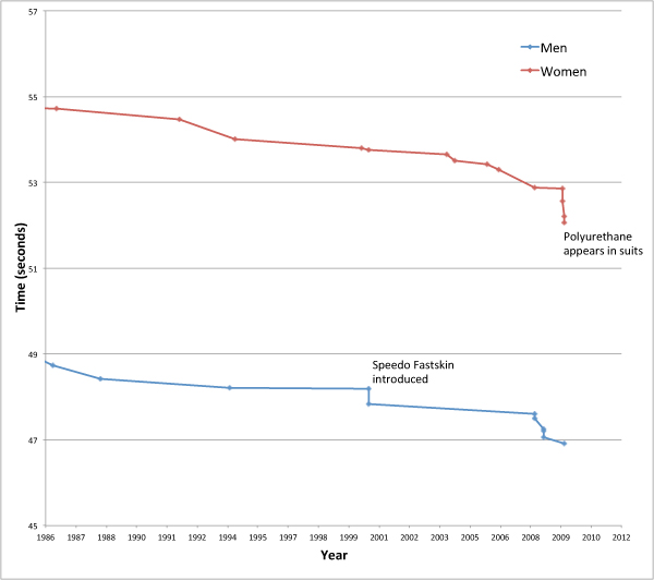
The figure below shows a close-up of times from the early 1980s. You can see the decline around 1999 when the first fast-suits came in, then the sharp decline in 2008. It is difficult to predict when the next dots on the curves will occur.

Zoom on times from 1980s

At the time of writing, Australians are the favourites for both the men's and women's 100 metre freestyle events, with James Magnussen and Matt Targett having recorded the quickest men's 100 metre times in 2012, and Melanie Schlanger the quickest women's time. The UK's Francesca Halsall is 5th so far this year in the women's event, however Simon Burnett in 39th would be doing well to make it past the heats in the men's.

Sunday, 6 May 2012

Travelling Salesman - the Movie

Science in the movies is a topic we've looked at a few times here on the blog. But this one is for the pure mathematicians. Check out this preview to the upcoming flick "Travelling Salesman".


I love these kinds of films - overly melodramatic acting, a slight misrepresentation of the science behind the plot (which is OK by me as this is a movie), government conspiracies, and mysterious music. The name "Travelling Salesman" comes from the famous mathematical Travelling Salesman Problem in which a salesman needs to visit a numerous destinations and wishes to do it in the shortest time. Whilst this may seem to be a simple problem, it is one of the most studied problems in mathematics. The more destinations involved, the more difficult to solve and in general there is no algorithm that can find the best answer. Brute force methods (that is, computing every possible solution and then finding the best) are computationally difficult, and with too many destinations, impossible. Hence mathematicians often use heuristics which find good, although not necessarily optimal, solutions quickly.

The premise of the movie is that the famous P vs NP problem has been solved. I'm not a pure mathematician, so I'll do my best here... P problems are those whose solutions can be found quickly (in Polynomial time, hence the P). NP problems are those whose solutions can not be found quickly, but if somehow a solution is produced using some extra information, it is easy to check that this solution is the best one (in polynomial time). Solving these problems take Non-deterministic Polynomial time - hence NP. A good example to show this is a jigsaw puzzle - finding a solution may be very difficult (and it's probably most accurate to image a blind person doing the puzzle), but it only takes a quick glance to see if any solution is correct.

The question that mathematicians ask is whether P=NP - which means, are there algorithms out there that solve seemingly NP problems in polynomial time? We haven't found any yet and mathematicians tend to think that P does not equal NP, but there is currently no proof. Proving this one way or the other is one of the seven Millennium Prize Problems selected by the Clay Mathematics Institute and carries a US$ 1,000,000 prize for the first correct solution.

But why do we care? One of the reasons is that modern cryptography is based on the fact that P does not equal NP - this is the premise of the movie. Modern codes start with a pair of large prime numbers p1 and p2 and multiply them together to give  m=p1p2. The number m is released to the public, but p1 and p2 are kept secret. To crack the code you have to find p1 and p2, given the value of m. It turns out that finding the prime factors of large numbers (100+ digits) is exceptionally difficult, although checking an answer is very easy. It is thought to be an NP problem. But if indeed P does equal NP, this suggests that out there somewhere is an algorithm that could solve this problem in quick time, meaning that modern encryption codes are vulnerable.

They don't give too much away in the preview, but I suspect what happens is they prove P=NP, although the example of looking for something hidden in the desert seems like a P problem (you just check out under each grain of sand, which would be easy, although it's a nice illustration of the problem). We stretch the science here a bit - even if you prove P=NP, you still need to find the appropriate algorithm for the problem, which has never been done. But hey, it's a movie, and we don't pull Terminator up on its stretching of science!

There is a very good write up of the P vs NP problem over on Plus - check it out, it does a much more thorough job than I do!

Saturday, 5 May 2012

Ep 145: Teleportation


Is teleportation possible in the real world, or only in the world of science fiction?

In this very special episode, Dr Boob takes the reigns and leads us on a journey through teleportation, whether or not physics allows it and even if it does, can we technologically achieve it? What are the implications if we recreate someone in another spot - what about their soul? Does such a thing exist? And even if you can technologically achieve this, is it possible to reanimate a copy of someone? What do you do with their original version, if you have simply copied them? This could be considered cloning, which brings in ethical questions.

Perhaps wormholes could be a solution to this problem, but we haven't found any yet - however they are, as physicists like to say, theoretically possible.

Tune in to this very entertaining episode (and I can say this without any false modesty as Dr Boob did it all himself) here.


If you'd like to hear more of Dr Boob on this podcast, check out our past joint episodes, mostly on the science of superheroes. He's also on twitter, so come and follow him, he needs friends!


Thursday, 26 April 2012

Ep 144: Two-up - an ANZAC Tradition

2012 update: I had a chat to Chris Coleman of ABC Riverina about the maths behind two-up. Check it out here and read on for the 2009 article on the maths.

It's an Australian tradition on ANZAC Day to take yourself down to your local pub and play Two-up - an Aussie gambling game in which you toss two coins in the air and bet on the outcome.

I'm somewhat embarrassed to say that even though I am only a month away from turning 30, this year was the first time I've ever actually gambled on two-up.

It's not a game that is played very often, despite being iconically Australian - according to the GAMBLING (TWO-UP) ACT 1998, outside of casinos it is only legal to play two-up on commemorative days like ANZAC Day (unless you're in Broken Hill, where the local council can legally arrange a two-up game any day of the year).

The rules of two-up are pretty simple. The Spinner places two coins (traditionally pennies) on a small piece of wood (the kip) and tosses the coins into the air. In the version of two-up we played at the pub, the gambling was very simple. Players standing around the Spinner either gambled on HEADS - which is where both coins come up heads - or TAILS - which is where both coins come up tails. If a head and a tail come up, the coins are tossed again and no one wins or loses. To bet, you find someone else willing to gamble the same amount but opposite to you, and then you have a one-on-one contest. If you want to bet $10 on HEADS, then you find someone willing to bet $10 on TAILS, and if you win you get their $10 - if you lose, you hand over $10. It's very simple and I love its inbuilt honour system.

The probabilities involved are simple too - you have a 50% chance of winning each time you bet. At the start of our ANZAC day down in Balmain, most people were betting $5. By the end of the day, as more beers were consumed, many were betting $50 and $100. Gambler's Ruin also started to show it's head - many people think that by doubling your bet after you lose you can get yourself back into the game. This doesn't work in this form of two-up for a couple of reasons. The first is that you need to find someone willing to bet the same amount as you, which is increasingly unlikely the larger you want to bet. And secondly, unless you have unlimited funds (or strictly speaking, more than everyone else you could bet against - or the casino if you are gambling there), it is highly unlikely that you could continually bet without going out backwards.

Two-up is also played in casinos and other gambling houses, and not just on ANZAC day. The rules, as you would expect from such institutions, are not so simple. In this expanded form of the game, there are a number of ways to bet. The South Australian Government has a good guide to two-up play, but simply put:

Players can bet in the following ways:

1) HEADS - odds of 1/1 ($1 bet pays $2, including your original $1);
2) TAILS - odds of 1/1;
3) 5 consecutive ODDS - odds of 25/1 ($1 bet pays $26).

The Spinner can bet in the following ways:

1) 3 HEADS are thrown before TAILS is thrown and before 5 consecutive ODDS are thrown - odds of 7.5/1 ($1 bet pays $8.50);
2) 3 TAILS are thrown before HEADS is thrown and before 5 consecutive ODDS are thrown - odds of 7.5/1.

This makes the game a little bit more interesting. The Wizard of Odds website for two-up sets out the probabilities for each of these outcomes - let's derive where they come from. At each toss of the kip, for this analysis it is best to think of there being 3 possible outcomes - HEADS, TAILS or 5 consecutive ODDS. We think of it this way because if a single ODDS is thrown, it is re-thrown and only makes a difference if it is one of five in a row.

Player Odds:

As you can see, the House is paying out as if the odds are better than they actually are. It's not much, but this is how they make their money.

Spinner Odds:

Again we can see, the House is not paying enough for a win - the odds should be 7.8 to 1, rather than 7.5 to 1. However, were you to back HEADS on each throw rather than as the group of three, the house would offer you odds of 7 to 1 (this is left as an exercise for the reader...), so the spinner's bet is better.

As it turns out, I came out even at the end of the day! There's some more maths to be had here - sometime soon we might take a look at some of these pay-out distributions.

Sunday, 12 February 2012

The Big Swim

Recently I competed in one of Australia's biggest ocean swims, The Big Swim. Now I'm not particularly good, just stupid and competitive, and the results provide a nice sporting dataset with which to play. I've wanted to teach myself some mapping / visualisation techniques for a while, so I took the opportunity to investigate this data in order to find out from where competitors for the event came, and from where they are the quickest.

I have created the following interactive chart using Google Fusion Tables. From the swim results, I extracted the competitors' times and the suburbs they came from, and then mapped the suburbs to their postcode using the aus-emaps postcode finder. From this table I worked out the average, minimum, maximum and median times for each postcode. I've only plotted New South Wales postcodes.

The tricky part was mapping the postcode boundaries. Thankfully, the Australian Bureau of Statistics has a couple of files you can use, however to use these with Google Maps, you need to convert them to the kml file type. MyGeodata Converter provide such a service. This meant we had two files - one with the swimmer statistics per postcode, and one with the boundary coordinates. It is easy to merge these tables with Google Data Fusion, and voila, you have an intensity map.

The map below is coloured by the number of competitors from each postcode - red is the most and green the least. The most swimmers came from postcode 2026, which is Bondi and surrounds. Many postcodes, including my own, only had one competitor. If you click on a postcode, it will give you that postcode's statistics - note that the times are in decimal (Google Data Fusion has some issues with data type, so it was easiest to treat the times as decimals, rather than date/time format). So 51.58 minutes means 51 minutes 35 seconds.

The quickest postcode (that had over 10 competitors) was 2075 (St. Ives and surrounds). The slowest with over 10 competitors was 2153 (Baulkham Hills and surrounds). One might postulate that Baulkham Hills is too far from the beach, and that everyone in St. Ives has a private swimming coach. Or it could just be random, as there really aren't enough swimmers per postcode to draw too many conclusions.

The biggest bug in this is the "Sydney" postcode which is, I'm fairly sure, way over populated due to people putting "Sydney" down instead of their suburb in their swim registration. Not that many people live in the city.


The following chart shows the distribution of times, which looks quite like a normal distribution with a slight right skew due to the fact that there is a hard limit on the quickest you can possibly complete the swim, whilst you can take as long as you like to finish. Large public sporting events tend to have a long tail as people may come out once a year and jump in the ocean without particularly caring how quickly they go. This is especially true for running events where you often have people dressed up as Snoopy out the back. Ocean swim events tend to have less of this as, unlike running, if you stop, you drown! So without a very long tail, the Central Limit Theorem kicks in and gives you a normal-ish (or log-normal distribution) distribution.


References:
  1. The results come from the Ocean Swims website (which is an excellent source of information for ocean swimming in Australia) - the Ocean Swim Series website is also a good data source.
  2. Make your own tables and maps at Google Fusion Tables.
  3. The postcode information came from the Australian Bureau of Statistics and aus-emaps.
  4. I converted the ABS data to a kml file using MyGeodata Converter.
  5. All Things Spatial is a great resource for data mapping

Thursday, 22 December 2011

Correlation of the year: Drinking encourages unsafe sex


If you thought the biggest science stories of 2011 concerned faster-than-light neutrinos, the Higgs Boson or the discovery of ever more exoplanets, you would be wrong.

Researchers at the Centre for Addiction and Mental Health in Toronto, Canada have performed a meta-analysis of 12 previously conducted experiments and found that drinking alcohol makes people want to have unsafe sex. Their paper, Alcohol consumption and the intention to engage in unprotected sex: systematic review and meta-analysis of experimental studies, published in the journal Addiction, showed that alcohol consumption directly impacts a person’s intention to have unsafe sex. That is, the more you drink, the stronger becomes your intention to engage in unsafe sex.

Well I never. Generations of children owe their lives to this phenomenon!

The researchers were actually testing something a little more subtle than this appears. They wanted to test whether alcohol consumption influenced the contraction of HIV via unsafe sex, or whether certain personality traits, such as a disposition to risky behaviour, would lead to both alcohol use and unsafe sex - that is, if the unsafe sex would have happened anyway, regardless of alcohol.

They found that the more people drank, the worse the decisions they made. An increase in blood alcohol level of 0.1 mg/mL led to a 5% increase in the likelihood of unprotected sex.

"Drinking has a causal effect on the likelihood to engage in unsafe sex, and thus should be included as a major factor in preventive efforts for HIV," said principal investigator Juergen Rehm in a statement. "This result also helps explain why people at risk often show this behaviour despite better knowledge: alcohol is influencing their decision processes."

So remember this over the holidays at your work Christmas parties when your boss starts to look good after 8 beers. And at your family gatherings, your second cousin is still related....

References:
Rehm, J., Shield, K., Joharchi, N., & Shuper, P. (2012). Alcohol consumption and the intention to engage in unprotected sex: systematic review and meta-analysis of experimental studies Addiction, 107 (1), 51-59 DOI: 10.1111/j.1360-0443.2011.03621.x

Friday, 25 November 2011

My favourite Sesame Street science videos

I'm stranded at Adelaide airport with my flight delayed for four hours, so what better way to get back onto the blog than by sharing my favourite Sesame Street science videos (Sesame Street having recently resumed it's exalted position in my life). The other day they were using the scientific method to deconstruct fairy tales - how would you tell the difference between the Big Bad Wolf and Grandma? Those videos aren't up online yet, but let's kick this off with comedian Craig Ferguson helping to define the word "experiment".


Here's Elmo and a Justin Bieber look-alike singing "Measure, Yeah, Measure," to the tune of Bieber's song "Never Say Never." I like his hair flicks. Elmo measured it, yo.


This is pretty cool, a Cookie Monster interactive video teaching us about experiments and things that float:


In this one, Emma Stone balances stuff on her head:


Here's Ernie showing all the curiosity of a good scientist:


And this is not sciencey, but it's the best Sesame Street video. Cutest thing you will ever see!

Friday, 29 July 2011

The 27 Club


Brian Jones, Jimi Hendrix, Janis Joplin, Jim Morrison, Kurt Cobain, and this week tragically Amy Winehouse, all died at the age of 27. This coincidence has spawned the notion of the 27 Club - a club whose members are influential musicians who died at the age of 27. But is there anything statistically significant about this club? Should musicians fear turning 27?

There are a few things that we should note before starting this investigation:
  1. It's quite clear that it is not true to say that more influential musicians die at the age of 27 than at any other age. If this were true, musicians would be dying all the time, and the facts that our radios are filled with golden oldies and John Farnham keeps touring are testament to this. 
  2. We will never find enough data to fully test out any theory we come up with. For example, what defines an "influential" musician? One approach might be to scour wikipedia and find the death dates of every artist who had a top ten hit in the last 50 years. I leave this as an exercise for the reader.
What we will do for this article is redefine the club to be for musicians who have died through misadventures with drugs. And what do you know, wikipedia has an article dedicated to just this topic - a list of celebrities who had drug-related deaths. Looking at just the 100 musicians in the list, we get the following distribution for lifespans of musicians who died through drug misadventure.

This distribution has an average of 36, a median of 34 and a mode of 28. All pretty close to 27. Maybe there's more to this than we thought. This can be compared to Australian Bureau of Statistics data for Australian males between 2007 and 2009. It's clear that musicians who have drug-related deaths are dying at a much younger age than Australian males. Note the caveat here, the musicians aren't dying of old age - these are only musicians who have drug-related deaths.


It's easy enough to come up with a theory for this. Musicians - indeed society at large - are most likely to start being exposed to drugs at the age of 20. In any case, before this time there aren't many musicians popular enough to have a wikipedia page or a public influence strong enough to be accepted into the 27-Club. The number of deaths seems to drop off after about the age of 40, but this is not because they are all becoming family oriented and leading a clean life. The number drops because there are less musicians alive at 40 to die. This is the same explanation for why less people in the general population die at the age of 95 than do at 80 - not that many people live long enough to die at 95.

The following chart displays the probability of dying within the next five years given that you have survived to now. For example, if you are currently in the 60-64 year age range, this chart shows the probability of dying in the 65-69 year age range. For musicians who have drug-related deaths, between the ages of 20 and 65, the chance of dying in the next 5 years is between 25-50%. Within the noise of the small sample set, its about the same for each 5 year category between 20 and 65, perhaps increasing slightly with age. This suggests that for influential musicians, if they are going to die through drug use, they have roughly the same chance of dying within the next 5 years no matter how old they currently are, perhaps a little higher if they're older. The probability of death doesn't peak at 27, and conversely, just because you have survived till now doesn't mean you have a greater chance of surviving the next five years. This is similar to the distribution of cricket batting scores, for those interested.

The peak at 25-29 in the previous chart occurs only because the musicians have not died before that age and suggests there is nothing supernatural about the number 27 (despite the curse of 27). Note that for Australian males, the data stops at 100 so the 100+ bar represents dying above this age. For the musicians, the data stops at 70-74, hence its peak at 100%.


Note again that this analysis is for musicians who die drug related deaths. It doesn't suggest that musicians have shorter lifespans than the average Australian male - it does however suggest that musicians who die via drugs have shorter lifespans. This could be because if you are going to die a drug-related death you are likely to die young because taking drugs is a risky endeavour, or it could be because by the age of 75 you have probably stopped doing drugs and so your death doesn't appear in the chart.

So is there anything to the 27 club? Not really. We've shown (albeit with just one rather incomplete article on wikipedia) there is nothing magical about the age of 27 - indeed 28 seems more interesting - and the peak in drug-related deaths around this age is quite predictable. Far more musicians die at an older age of other causes just like the rest of us, and somehow Keith Richards is still alive. The club exists because humans like to associate meaning to patterns. We're very good at pattern recognition. Our ability to associate the seasons with animal migrations, and the stars in the sky with when to plant vegetables, gave us an advantage throughout evolution. However, false pattern recognition doesn't get us killed and so we often spot patterns where they don't exist - for example, we see faces in the World Trade Center disaster, or the Virgin Mary at the beach. Some even believe that because of this, we have created religion to explain patterns we can't explain.

A nod here to the like-minded Bespoke Blog and its article Morbid Statistics & The 27 Club which I found quite coincidentally as I was finishing up this article. 

Sunday, 17 July 2011

Ep 143: TedxSydney - Bryan Gaensler

TED is a US based not-for-profit enterprise devoted to the propagation of Ideas Worth Spreading. TED started out in 1984 as a conference bringing together people from three worlds: Technology, Entertainment and Design. TedxSydney was a Sydney-based TED event, bringing people together to share a TED-like experience. I ducked out to Carriage Works to catch some of the event, and you can see all the talks over at the TedxSydney youtube channel. Many of these talks were science based, so I'm going to put up some of my favourites over the next few posts.

The following video is from Bryan Gaensler, former Young Australian of the Year, NASA Hubble Fellow and Harvard professor, Australian Laureate Fellow at The University of Sydney, and Director of the Centre of Excellence for All-sky Astrophysics. His talk was entitled A new way of looking at the sky.


Ted Copyright
TEDTalks are distributed under a Creative Commons (CC) license. Anyone is free to download the videos from TED.com; share them with friends; republish or embed them on their website or blog. But this use must be made within the terms of the CC license "Attribution -- NonCommercial -- NonDerivative."

Monday, 13 June 2011

Ep 142: Beyond Zero Emissions


Beyond Zero Emissions is a not-for-profit, volunteer run organisation whose core goal is to develop blueprints for the implementation of climate change solutions. In partnership with the University of Melbourne's Energy Research Institute, BZE are undertaking the Zero Carbon Australia 2020 Project, which puts together fully costed transition plans for getting Australia to zero emissions in ten years using commercially available technology.

Last year I attended their launch event for the Zero Carbon Australia Stationary Energy Plan which goes into detail about how Australia can reach 100% renewable energy within a decade. Speakers at the launch included former NSW premier Bob Carr, member for Wentworth Malcolm Turnbull, Greens Senator Scott Ludlam and Matthew Wright, Executive Director of BZE. The event was hosted by journalist Quentin Dempster.

In this podcast, with permission from Matthew Wright, I bring you Matthew's speech at this launch which details the science behind their proposal. I also chatted to BZE volunteer Petra Liverani at the recent Say yes to a price on carbon pollution rally in Sydney.

Click play below or listen to this show here:


If you'd like to hear what Turnbull, Carr and Ludlam had to say, check out the full video of the launch below, reproduced here with permission.

Wednesday, 8 June 2011

Total lunar eclipse across Australia (or what is a syzygy)


Today I learnt a new word.

Syzygy.

A syzygy is a straight line configuration of three celestial bodies (such as the Earth, Sun, and Moon), and on Thursday 16 June, if you can get yourself up before dawn, you will witness a syzygy - in this case a total lunar eclipse - above the western horizon as the Moon passes through Earth’s shadow. This syzygy ends at sunrise in all states but Western Australia. It has been something of a star and planet watcher's dream recently, with four planets having lined up in the sky during May.

The eclipse begins at 3:25am AEST and enters its darkest phase at 05:22am AEST when the transformation to a blood-red Moon should begin. The colour of the eclipse depends on the amount of dust in the Earth's atmosphere. The red colour comes about because sunlight reaching the Moon passes through the Earth’s atmosphere where it is scattered. Shorter wavelengths (blue) are scattered more by  air molecules and dust particles than longer wavelengths (red), and so by the time the light has passed through the atmosphere, the light is mainly red. In extra-solar planets - planets in other solar systems - lunar eclipses can be used to determine the content of the planetary atmosphere. You might remember back to 2009 when Sydney was covered in dust and turned red to gauge a feeling for what the colour could be like - check out that article for a fuller description of the physics involved as it is similar.

If you are keen enough to not only get out of bed but to leave your house, Sydney Observatory is hosting a special breakfast viewing which includes tea, coffee, croissants and “blood-red” jam. Book at the Sydney Observatory website.

This material came from the Sydney Observatory.

Wednesday, 1 June 2011

There is more kicking in Union than League (and other misconceptions)


If you listened to the crowd at a Waratahs (Rugby Union) game, apart from wondering which side the so-called fans were barracking for, you'd think that the Waratahs kicked the ball too much. If you have ever listened to a Rugby League fan wax lyrical about how Union teams keep kicking the ball away and how League teams know how to cross the try line, you might start to become convinced that Union teams really do kick too much. But as we like to do here, let's put these popular notions to the test. Is there really more kicking in Union than League?

The question originated at my work, where most Mondays - indeed most days of the week - we debate the relative merits of the two rugby codes. So if for no other reason than to prove my own hunch, I compiled the data for the current season of the Australian National Rugby League (after round 12) and the three nation Super Rugby (after round 15) tournaments. The following chart shows the distribution of the number of times each game a team kicks the ball.

Kicks per team in a game of rugby and league
We can conclude:
  • This year in the NRL, each team averages 19.05 kicks per game. In Super Rugby, each team averages 19.07 kicks per game - there is essentially no difference between the average number of kicks in a Union game and a League game in 2011. The difference of 0.02 is well below what we need for statistical significance;
  • Both sets of data look pretty-much bell shaped - that is, they are close to normal distributions (probably as a result of the Central Limit Theorem). The League distribution is thin and tall - there is only a small distribution about the mean (standard deviation of 3.8) - whilst the Union distribution is fatter (standard deviation of 6.2). This suggests that in a League game, most of the time teams will kick somewhere near this average number of times (19), whilst in a Union game you are more likely to see a game with not many kicks or a game with a lot of kicks. This is a result of the fact that in League, after the 5th tackle, you don't have many other options but to kick, whilst in Union, with an unlimited tackle count and continual contest for the ball, you have more options for when and how often you wish to kick.
  • The notion that it's the boring teams that kick too much take another hit when you look at the teams who actually do kick the most. The Reds, lauded this year for playing running rugby, are top of the kick table, whilst the Brumbies, who can't beat anyone, are stuck at the bottom of the kick and Super Rugby tables. In the NRL, the top three kicking teams are 3 of the top teams in the competition. Check out Green and Gold Rugby for more on the Super Rugby kicking stats.

    Super 15NRL
    Reds23.8Dragons21.9
    Waratahs22.8Storm20.6
    Cheetahs21.1Broncos20.5
    Rebels20.7Eels20.4
    Stormers20.1Sea Eagles20.2
    Bulls19.9Warriors19.4
    Sharks18.9Raiders19.4
    Force18.7Rabbitohs19.4
    Blues18.6Sharks19.2
    Chiefs18.6Knights19.2
    Crusaders17.4Cowboys18.6
    Hurricanes17.2Panthers18.2
    Lions16.5Bulldogs18.2
    Highlanders16.4Titans17.7
    Brumbies14.5Roosters16.5
    Wests Tigers15.6
  •  
  • I find it fascinating that the averages come out so close. It's over 100 years since the codes split from their common ancestor, and despite numerous law changes and evolutionary paths, teams in League and Union seem to want to hold onto the ball, on average, for about the same amount of time. In league, you are limited to 6 tackles, so could it be that the law-makers of League, when devising the 6 tackle rule, knew instinctively that this is the right balance of attack and defence? Does this balance give the players just the right amount of rest during a game? Or is it all a coincidence?
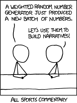
And while we're on the topic of maths and sport, it's important when doing statistical analysis on sport that you analyse the right thing and take note of statistical significance. Despite the popular saying, statistics don't lie, but poor use and interpretation of them does. I think this comic from xkcd sums up how I feel when I listen to ex-professional sportsmen commentating on sport...


With regards to cricket, we have shown here on the blog that a batsman's cricketing scores over his career fit the exponential distribution very well, suggesting that many notions of cricketing form, and discussions of it, are quite troublesome - that is, it's not form creating the fluctuations in a batsman's career, but the very nature of the game itself. Deep.

Kicking images courtesy State of Union address - Tom Bradshaw's rugby blog. Yes I support the Waratahs and believe wholeheartedly that Rugby Union is a much better game than League. And unlike other Waratahs fans, I think they're actually pretty good!

Sunday, 15 May 2011

How the planet alignment worked (and why astrology does not)


Did you get up at 5am and brave the cold to see the planets align? If you had, you would have seen something like this. Venus and Jupiter were very bright, Mercury was fainter and eventually fell behind some clouds, and I couldn't see Mars at all with the naked eye. It was only with this long exposure shot that I could see what I think to be Mars. I've put up a bunch of photos on flickr.

All four planets over Canterbury, Sydney

The reason we were treated to this early morning light show was because of a rare alignment of the planets. It's not rare due to being unexpected - it's completely predictable - it just doesn't happen all that often. The next time these four planets will get together will be in 2056.

The following images have been made using the excellent Solar System Live by John Walker. The site shows the positions of the planets around the Sun, and in the sky, either live or at a time of your choosing. On May 13, the four inner planets were all in a straight line and from Earth you could view the other three clumped together in the sky. The images show the solar system from above, with the orbits spaced equally for ease of viewing. From this viewpoint, the Earth spins counter-clockwise on its axis, and counter-clockwise around the Sun. The alignment of planets is not seen until just before dawn, however as the Earth continues to rotate and the Sun comes into view, the light from the Sun becomes too strong to see the planets (you rarely see stars or planets during the day). Unseen, they continue to track overhead during the day. By the end of May, as the various planets move at different orbital speeds around the Sun (a year is different on each planet), they will be in different parts of the sky and the light show over.

Inner Planets

If you take a closer look at the figure below, you'll notice that besides the aligned planets, there are actually six planets visible in the dawn sky - all planets except Saturn can be spotted if you find a dark enough area, although you'll need binoculars to see Uranus and Neptune. Even Pluto, if you still maintain it to be a planet, might be found with a small telescope - the Solar System live site still has Pluto in its diagrams. A crescent Moon will reappear near the end of May to add to the scenery.

All planet line up

For more information, this video from ScienceCasts gives a great overview of the phenomenon, showing how the planets move in the sky throughout May. It's also a geometry lesson before breakfast. Check out science.nasa.gov for more.


Astrology
The alignment of the planets has various meanings in astrology and some astrologists maintain that there is science behind their beliefs, often claiming the precise positioning of the planets and stars at your birth effects you through gravity. Whilst these effects may be small, some claim they're enough to influence your developing brain and therefore your personality. Let's test the theory. To find out the gravitational force between two masses, we use Newton's law of universal gravitation:


where:
  • F is the force between the masses,
  • G is the gravitational constant,
  • m1 is the first mass,
  • m2 is the second mass, and
  • r is the distance between the masses.
We can use this to examine the gravitational force between a one kilogram mass on the surface of the Earth and the distant planets. The distances the planets were from Earth on May 13 were obtained from Solar System Live, and their masses from NASA. I've also included the gravitational effect of my car if you were standing 50 cm from it.
gravity
As you can see, the gravitational effect of my 1.5 tonne car is greater than all the planets put together.

It is also important to note that on May 13, the pull of the Moon on our 1kg object was 199 times bigger than that of Jupiter's at the Earth's surface. The Sun's pull was 178 times bigger than the Moon's, and the pull of the Earth itself was 1656 times bigger than the Sun's. Essentially, the pull of the planets on an object at the Earth's surface is negligible. The calculations can be explored in this spreadsheet. Read more over at Bad Astronomy debunking the claims of astronomy, especially with regards to gravity and the tides.

So, don't blame Jupiter if luck doesn't favour you this month - blame my car. Oh Marc, that is such a Taurian thing to say...

Wednesday, 11 May 2011

Four planets align over Sydney at dawn Friday 13 May


When the moon is in the Seventh House
And Jupiter aligns with Mars
Then peace will guide the planets
And love will steer the stars.

The age of Aquarius has arrived! Well, it will, this Friday 13th May.

In a rare planetary event, Mercury, Venus, Mars and Jupiter, will appear together (within around 2 degrees of each other) in the eastern sky just before dawn this Friday. The event will be particularly spectacular for Sydneysiders. From 5am, the four planets will be clearly seen just above the horizon in the east. The brightest planet will be Venus sitting in the middle of the group. Just above and to the left of Venus and almost as bright is Jupiter. To the right of Jupiter and slightly fainter will be Mercury. Sitting below these three planets and fainter again will be Mars. The four planets are quite bright, so if you are up early enough, you will see them over city lights.

If you have been up early recently (I had the pleasure of a 5am start today for work...) you will have already noticed Venus and Jupiter together. The last time these four planets came together was in 1910, but the planets were too close to the Sun to observe. The next close grouping of these planets will not be until 2056.

“The close grouping of these particular four planets only happens every 50 to 100 years. We are hoping for a clear autumn morning for this unique sight in the southern sky,” said Sydney Observatory’s acting curator, Andrew Jacob. The event will be visible to the naked eye and Sydney Observatory is holding a breakfast viewing. If you are interested in getting along, there is more information at www.sydneyobservatory.com.au, and check out the Observatory's blog.

The last cool astrological event that we've seen in Sydney was back in 2008 when the Moon, Venus and Jupiter aligned to form a smiley face in the sky. I was a bit late for the happy face but managed to capture a grainy celestial sad face. Time will tell whether I manage to drag myself out of bed at 5am for this latest viewing - with a new born bub, you never know...


Addendum: Here's an explanation of how the alignment gave such a great view from Earth, and why my car is more likely to influence your personality - astrologically speaking - than this rare alignment.

Friday, 22 April 2011

Ep 141: Science of Superheroes - Harry Potter


And we're back! It's been a while, but finally it's time for another podcast, so we've made it a long one. Take this episode on a long train ride or car trip, as Dr Boob and I explore the science of the spells of Harry Potter.

Attempting to find scientific and engineering solutions to Harry Potter spells is probably the most difficult task we have set ourselves yet, so we would be very interested to hear how you would made the Harry Potter spells a reality. The spells dealt with in this episode are:
  1. Lumos - Producing light from the end of a wand (A voice activated torch seems a logical solution),
  2. Aguamenti - Shooting water from the end of the wand,
  3. Alohomora - Picking a lock at a distance,
  4. Expecto Patronum - Protection against evil dementors in the form of some virtual creature,
  5. Sectumsempra - Slicing your opponent open,
  6. Aparecium - Reading invisible ink,
  7. Accio - Summoning things to you,
  8. Expelliarmus - Disarming your opposition of their wand,
  9. Confundo - Confusing the victim,
  10. Stupefy - Stunning the victim,
  11. Invisibility cloak - Covering yourself in a cloak to make yourself invisible,
  12. Imperio - Forcing your victims to obey your commands,
  13. Obliviate - Erasing the memories of the victim,
  14. Legilimens - Telepathy.
Although some of these are quite clearly impossible at the moment, in every case we have come up with a scientific or engineering solution to take us at least part of the way there. Listen in to find out what we came up with, and please write in and let us know where we have gone wrong or what you would do.

Click play below or listen to this show here.


References:
  1. Santos, V., Paula, W., & Kalapothakis, E. (2009). Influence of the luminol chemiluminescence reaction on the confirmatory tests for the detection and characterization of bloodstains in forensic analysis Forensic Science International: Genetics Supplement Series, 2 (1), 196-197 DOI: 10.1016/j.fsigss.2009.09.008
  2. A.J. Barnier and D.A. Oakley (2009). Hypnosis and Suggestion Encyclopedia of Consciousness DOI: 10.1016/B978-012373873-8.00038-4
  3. T.C. Jerram (1982). Hypnotics and sedatives Side Effects of Drugs Annual DOI: 10.1016/S0378-6080(82)80009-3
  4. Wood, B. (2009). Metamaterials and invisibility Comptes Rendus Physique, 10 (5), 379-390 DOI: 10.1016/j.crhy.2009.01.002

Tuesday, 5 April 2011

Are NSW players over-represented in the Australian cricket team?


In every sports competition in the world, fans of one team will claim another team gets more favourable treatment than their own, whether it’s selection in representative teams, concessions regarding player salaries or favourable refereeing decisions. Cricket in Australia is no different. The dawn of summer is almost inevitably accompanied by bleating, generally from Victorian fans, about how players from New South Wales are more likely to be selected in the national team than players from other states. This opinion found a voice in David Hookes, who claimed:

"When they give out the baggy blue cap in New South Wales, they give you a baggy green one in a brown paper bag as well to save making two presentations."

It’s about time we put this idea to the test. Since the 1977/78 season, all 6 Australian states have played in the Sheffield Shield, Australia’s domestic first-class cricket competition. Since 1982/83, the season has culminated in a grand final (previous to this the winner was determined league style by whoever won the most throughout the season). I will use data from 1982/83 till now for consistency and so that all states are represented. The following table shows the players who have debuted for Australia since the start of the 1982/83 season, the state they were playing for at the time of their debut, and the number of Tests they played throughout their career.

PlayerYearsTestsStatePlayerYearsTestsState
Carl Rackemann 1982–9112QldMatthew Elliott 1996–200421Vic
Kepler Wessels 1982–8524QldMichael Kasprowicz 1996–200638Qld
Tom Hogan 1983–847WAJason Gillespie 1996–200671SA
Roger Woolley 1983–842TasAndy Bichel 1997–200319Qld
Wayne B. Phillips 1983–8627SAShaun Young 19971Tas
John Maguire 1983–843QldSimon Cook 19972NSW
Greg Matthews 1983–9333NSWStuart MacGill 1998–200844NSW
Steve Smith 19843NSWGavin Robertson 19984NSW
Dean Jones 1984–9252VicPaul Wilson 19981SA
David Boon 1984–96107TasAdam Dale 1998–992Qld
Bob Holland 1984–8611NSWDarren Lehmann 1998–200427SA
Murray Bennett 1984–853NSWColin Miller 1998–200118Tas
Craig McDermott 1984–9671QldMatthew Nicholson 19981WA
Simon O'Donnell 19856VicAdam Gilchrist 1999–200896WA
Dave Gilbert 1985–869NSWScott Muller 19992Qld
Robbie Kerr 19852QldBrett Lee 1999–201076NSW
Merv Hughes 1985–9453VicSimon Katich 2001–56WA
Geoff Marsh 1985–9250WAMartin Love 2002–035Qld
Bruce Reid 1985–9227WABrad Williams 2003–044WA
Steve Waugh 1985–2004168NSWNathan Bracken 2003–055NSW
Simon Davis 19861VicAndrew Symonds 2004–0926Qld
Tim Zoehrer 1986–8710WAMichael Clarke 2004–67NSW
Chris Matthews 1986–883WANathan Hauritz 2004–17Qld
Greg Dyer 1986–886NSWShane Watson 2005–25Qld
Peter Taylor 1987–9113NSWShaun Tait 2005–083SA
Mike Veletta 1987–908WAMichael Hussey 2005–57WA
Tim May 1987–9524SABrad Hodge 2005-086Vic
Tony Dodemaide 1987–9210VicPhil Jaques 2005–0811NSW
Ian Healy 1988–99119QldStuart Clark 2006–0924NSW
Trevor Hohns 19897QldDan Cullen 20061SA
Mark Taylor 1989–99104NSWMitchell Johnson 2007–40Qld
Greg Campbell 1989–904TasChris Rogers 20081WA
Tom Moody 1989–928WABrad Haddin 2008–30NSW
Mark Waugh 1991–2002128NSWBeau Casson 20081NSW
Shane Warne 1992–2007145VicCameron White 2008–094Vic
Wayne N. Phillips 19921VicPeter Siddle 2008–20Vic
Paul Reiffel 1992–9835VicJason Krejza 20082Tas
Damien Martyn 1992–200667WADoug Bollinger 2009–12NSW
Justin Langer 1993–2007105WAAndrew McDonald 20094Vic
Jo Angel 1993–954WABen Hilfenhaus 2009–15Tas
Michael Slater 1993–200174NSWPhillip Hughes 2009–8NSW
Brendon Julian 1993–957WAMarcus North 2009–21WA
Glenn McGrath 1993–2007124NSWBryce McGain 20091Vic
Matthew Hayden 1994–2009103QldGraham Manou 20091SA
Michael Bevan 1994–9818NSWClint McKay 20091Vic
Damien Fleming 1994–200120VicRyan Harris 2010–4SA
Phil Emery 19941NSWTim Paine 20104Tas
Greg Blewett 1995–200046SASteven Smith 2010–3NSW
Peter McIntyre 1995–962SAPeter George 2010–1SA
Stuart Law 19951QldXavier Doherty 20102Tas
Ricky Ponting 1995–151TasMichael Beer 2011–1WA
Brad Hogg 1996–20087WAUsman Khawaja 2011–1NSW

Of the 104 players who debuted after 1982/83, 28 were playing for NSW when they were first picked for Australia (27% of the new players).

PlayersPercentage
NSW2827%
WA2019%
Qld1817%
Vic1615%
Tas1010%
SA1212%

Clearly NSW players have played more Tests. But is this unreasonable? There are two measures we can look at here. Sheffield Shield results and state populations. The following shows the results of the Shield since 1982/83.

Season Winner Second Third Fourth Fifth SixthSeason Winner Second Third Fourth Fifth Sixth
1982–83 NSWWASATasQldVic1997–98 WATasQldNSWVicSA
1983–84 WAQldTasNSWSAVic1998–99 WAQldVicSATasNSW
1984–85 NSWQldSAWAVicTas1999-00 QldVicWASATasNSW
1985–86 NSWQldVicWASATas2000–01 QldVicNSWTasWASA
1986–87 WAVicQldSANSWTas2001–02 QldTasWASAVicNSW
1987–88 WAQldNSWVicSATas2002–03 NSWQldVicSAWATas
1988–89 WASAQldNSWTasVic2003–04 VicQldTasWANSWSA
1989–90 NSWQldSATasWAVic2004–05 NSWQldWAVicSATas
1990–91 VicNSWQldWASATas2005–06 QldVicSATasWANSW
1991–92 WANSWVicQldSATas2006–07 TasNSWVicQldWASA
1992–93 NSWQldWASATasVic2007–08 NSWVicWATasSAQld
1993–94 NSWTasWAVicSAQld2008–09 VicQldSATasWANSW
1994–95 QldSAVicWANSWTas2009–10 VicQldNSWWATasSA
1995–96 SAWAQldTasNSWVic2001–11 TasNSWQldWAVicSA
1996–97 QldWANSWTasVicSA

NSW has won 9 Shields, ahead of WA’s 7. If you look at the percentage of Shield wins per state and compare this to the number of players picked for Australia from that state, you will notice that these results are remarkably similar. Is it any surprise that the most successful team over this time has more players picked for representative honours? If you look at all the Tests played since 82/83, 34% of the Test positions up for grabs were occupied by NSW players, and the order of states is exactly the same as the order for number of Shield wins. This is strong evidence that rather than a selection bias, players are being picked either because they are the best players or because they have been a part of successful teams.

PlayersTestsShield wins
NSW2827%98334%931%
WA2019%54018%724%
Qld1817%51618%621%
Vic1615%38013%414%
Tas1010%30610%27%
SA1212%2087%13%

The second way to look at this is by state population. I don’t particularly like this method because sportsmen, especially in this professional age, move teams for many reasons, including for better opportunities and more pay, and don’t necessarily play for the state of their birth. The most populous state is not necessarily going to have the best team. But because this is often the first measure people look to when analysing team results (for example, Olympic results), and because arguably a larger population means a bigger economy and therefore more money flowing through the team, we shall include some analysis. Since 1982, NSW (+ACT) has averaged 36% of the total population of the states (excluding Northern Territory). Again, this matches quite closely the number of players picked for Australia – indeed, you might argue that more players from NSW should have been picked. It would be by this measure that Victorians may claim some bias.

PopulationShield Wins
NSW + ACT36%31%
Vic25%14%
Qld18%21%
WA10%24%
Tas3%7%
SA8%3%

Finally, let’s look at the one-test wonders – the players who only played one test.

One Test wonders
NSW3
WA3
Qld1
Vic4
Tas1
SA4

Victoria and SA share this honour with 4 one-test wonders – and this is possibly why David Hookes, of SA stock and coach of Victoria after his retirement, was cranky. In the case of SA, this is a third of their players who have made their debut since 1982/83 – indeed, 7 of their 12 Test players did not play more than 4 Tests. Tasmanian players also fair poorly in this regard, with 6 of their 10 players playing no more than 4 Tests – Tasmanian results are severely skewed by Ponting’s 151 and Boon’s 107 Tests.

No matter what state a Test player is from, he has roughly the same chance of playing 15 or more Tests. Thus the data does not support the idea that selectors are more likely to stick with NSW players through a patch of poor form.

Percentage of state Test players (15+ Tests)
NSW43%
WA40%
Qld56%
Vic44%
Tas40%
SA42%

I would be interested to hear your thoughts regarding this – I know it can stir some passions. But the data would suggest that there is no unfair bias towards NSW.

Further thoughts:
  • I have made no attempt to look at players moving state during their careers. Simon Katich, for instance, had a career revival when playing for NSW, even though he was originally picked for Australia when playing for WA. Nathan Hauritz similarly had his fortunes revived when playing for NSW, even though he debuted when playing for Queensland. There are also many examples of this working the other way – Jason Krejza moved to Tasmania, and Adam Gilchrist to WA, both from NSW and then made their debut. Even Don Bradman first played for NSW before an ongoing career with SA.
  • You could do the same analysis if you have time and patience on your hands for one-day and Twenty20 cricket.
  • It was quite difficult in some cases to track which state a player was playing for when they made their Australian debut, especially if they moved state soon after. I have put the data here (some of the array formulae don't work in Google docs, and I have stripped out the macros, but you can redo them). If I have made a mistake, let me know!